|
MACD Part 4 Part 1 | Part 2 | Part 3 | Part 4 |
| MACD-Histogram |
In 1986, Thomas Aspray developed the MACD-Histogram. Some of his findings were presented in a series of articles for Technical Analysis of Stocks and Commodities. Aspray noted that MACD would sometimes lag important moves in a security, especially when applied to weekly charts. He first experimented by changing the moving averages and found that shorter moving averages did indeed speed up the signals. However, he was looking for a means to anticipate MACD crossovers. One of the answers he came up with was the MACD-Histogram.
MACD
| Definition and Construction |
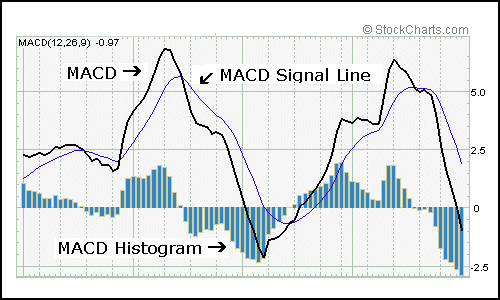
The MACD-Histogram represents the difference between MACD and the 9-day EMA of MACD, which can also be referred to as the signal or trigger line. The plot of this difference is presented as a histogram, making centerline crossovers and divergences are easily identifiable. A centerline crossover for the MACD-Histogram is the same as a moving average crossover for MACD. If you will recall, a moving average crossover occurs when MACD moves above or below the signal line.
If the value of MACD is larger than the value of its 9-day EMA, then the value on the MACD-Histogram will be positive. Conversely, if the value of MACD is less than its 9-day EMA, then the value on the MACD-Histogram will be negative.
Further increases or decreases in the gap between MACD and its 9-day EMA will be reflected in the MACD-Histogram. Sharp increases in the MACD-Histogram indicate that MACD is rising faster than its 9-day EMA and bullish momentum is strengthening. Sharp declines in the MACD-Histogram indicate that MACD is falling faster than its 9-day EMA and bearish momentum is increasing.
MACD

On the chart above, we can see that MACD-Histogram movements are relatively independent of the actual MACD. Sometimes MACD is rising while the MACD-Histogram is falling. At other times, MACD is falling while MACD-Histogram is rising. MACD-Histogram does not reflect the absolute value of MACD, but rather the value of MACD relative to its 9-day EMA. Usually, but not always, a move in MACD is preceded by a corresponding divergence in MACD-Histogram.
| Usage |
Thomas Aspray designed the MACD-Histogram as a tool to anticipate a moving average crossover in MACD. Divergences between MACD and the MACD-Histogram are the main tool used to anticipate moving average crossovers. A positive divergence in the MACD-Histogram indicates that MACD is strengthening and could be on the verge of a bullish moving average crossover. A negative divergence in the MACD-Histogram indicates that MACD is weakening and can act to foreshadow a bearish moving average crossover in MACD.
In his book, Technical Analysis of the Financial Markets, John Murphy asserts that the MACD-Histogram is best used to identify periods when the gap between MACD and its 9-day EMA is either widening or shrinking. Broadly speaking, a widening gap indicates strengthening momentum and a shrinking gap indicates weakening momentum. Usually a change in the MACD-Histogram will precede any changes in MACD.
| Signals |
The main signal generated by the MACD-Histogram is a divergence followed by a moving average crossover. A bullish signal is generated when a positive divergence forms and there is a bullish centerline crossover. A bearish signal is generated when there is a negative divergence and a bearish centerline crossover. Keep in mind that a centerline crossover for the MACD-Histogram represents a moving average crossover for MACD.
Divergences can take many forms and varying degrees. Generally speaking, two types of divergences have been identified: the slant divergence and the peak-trough divergence.
Unisys

A slant divergence forms when there is a continuous and relatively smooth move in one direction (up or down) to form the divergence. Slant divergences generally cover a shorter timeframe than divergences formed with two peaks or two troughs. A slant divergence can contain some small bumps (peaks or troughs) along the way. The world of technical analysis is not perfect and there are exceptions to most rules and hybrids for many signals.
General Electric

A peak-trough divergence occurs when at least two peaks or two troughs develop in one direction to form the divergence. A series of two or more rising troughs (higher lows) can form a positive divergence and a series of two or more declining peaks (lower highs) can form a negative divergence. Peak-trough divergences usually cover a longer timeframe than slant divergences. On a daily chart, a peak-trough divergence can cover a timeframe as short as two weeks or as long as several months.
Usually, the longer and sharper the divergence is, the better any ensuing signal will be. Short and shallow divergences can lead to false signals and whipsaws. In addition, it would appear that peak-trough divergences are a bit more reliable than slant divergences. Peak-trough divergences tend to be sharper and cover a longer time frame than slant divergences.
| MACD-Histogram Benefits |
The main benefit of the MACD-Histogram is its ability to anticipate MACD signals. Divergences usually appear in the MACD-Histogram before MACD moving average crossovers. Armed with this knowledge, traders and investors can better prepare for potential trend changes.
MACD-Histogram can be applied to daily, weekly or monthly charts. (Note: This may require some tinkering with the number of periods used to form the original MACD; shorter or faster moving averages may be required for weekly and monthly charts.) Using weekly charts, the broad underlying trend of a stock can be determined. Once the broad trend has been determined, daily charts can be used to time entry and exit strategies.
In Technical Analysis of the Financial Markets, John Murphy advocates this type of two-tiered approach to investing in order to avoid making trades against the major trend. The weekly MACD-Histogram can be used to generate a long-term signal in order to establish the tradable trend. Then only short-term signals that agree with the major trend would be considered. If the long-term trend were bullish, only negative divergences with bearish centerline crossovers would be considered valid for the MACD-Histogram. If the long-term trend were bearish, only positive divergences with bullish centerline crossovers would be considered valid.
IBM
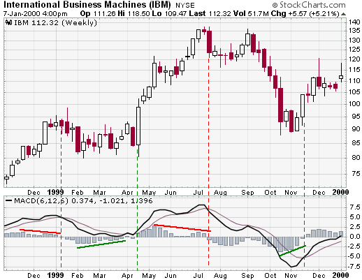
On the IBM weekly chart, the MACD-Histogram generated four signals. Before each moving average crossover in MACD, a corresponding divergence formed in the MACD-Histogram. To make adjustments for the weekly chart, the moving averages have been shortened to 6 and 12. This MACD is formed by subtracting the 6-week EMA from the 12-week EMA. A 6-week EMA has been used as the trigger. The MACD-Histogram is calculated by taking the difference between MACD (6/12) and the 6-day EMA of MACD (6/12).
The third signal was based on a peak-trough divergence. Two readily identifiable and consecutive lower peaks formed to create the divergence. The peaks and troughs on the previous divergences, although identifiable, do not stand out as much.
| MACD-Histogram Drawbacks |
The MACD-Histogram is an indicator of an indicator or a derivative of a derivative. MACD is the first derivative of the price action of a security and the MACD-Histogram is the second derivative of the price action of a security. As the second derivative, the MACD-Histogram is further removed from the actual price action of the underlying security. The further removed an indicator is from the underlying price action, the greater the chances of false signals. Keep in mind that this is an indicator of an indicator. MACD-Histogram should not be compared directly with the price action of the underlying security.
Because MACD-Histogram was designed to anticipate MACD signals, there may be a temptation to jump the gun. The MACD-Histogram should be used in conjunction with other aspects of technical analysis. This will help to alleviate the temptation for early entry. Another means to guard against early entry is to combine weekly signals with daily signals. There will of course be more daily signals than weekly signals. However, by using only the daily signals that agree with the weekly signals, there will be fewer daily signals to act on. By acting only on those daily signals that are in agreement with the weekly signals, you are also assured of trading with the longer trend and not against it.
Be careful of small and shallow divergences. While these may sometimes lead to good signals, they are also more apt to create false signals. One method to avoid small divergences is to look for larger divergences with two or more readily identifiable peaks or troughs. Compare the peaks and troughs from past action to determine significance. Only peaks and troughs that appear to be significant should warrant attention.
| MACD and SharpCharts2 |
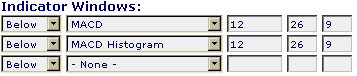
Using SharpCharts2, MACD can be set as an indicator above or below a security's price plot. Once the indicator is chosen from the drop down list, the three boxes to the right are used to adjust the settings. The default setting is (12,26,9), which automatically appears. The default would use a 12-day EMA and 26-day EMA to calculate MACD and a 9-day EMA of MACD as the signal/trigger line. MACD appears as the thick solid line and the signal/trigger line as the thinner and smoother line. Typically, MACD crosses above and below its signal line as it fluctuates around the zero line.
The histogram is the MACD-Histogram, which measures the difference between MACD and its signal/trigger line. Simply charting the MACD indicator will also create a MACD histogram as an overlay, or you can chart the histogram separately by selecting it from the drop-down menu. The scale shows the range of values for MACD. Stocks with low prices (eg between 10 and 20) will have a smaller MACD range and stocks with high prices (eg above 100) will have a higher MACD range.
Click here to see a live example of MACD.
Written by Arthur Hill