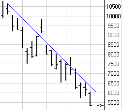
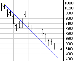
by Howard Arrington Every so often some trader engages in a discussion with me regarding the virtues of plotting 45 degree lines on their chart. Invariably their infatuation with this idea is based on a shallow understanding of what a 45 degree line really means, or is supposed to indicate. Their introduction to 45 degree lines is usually from reading something about the works of W. D. Gann and how he plotted 45 degree lines on his charts. Tip: Plotting a line on your computer generated charts physically at a 45 degree angle is worthless. The truth of this statement will be illustrated in this article. To illustrate the problem with a 45 degree line, compare these two charts.
The blue line is plotted at a downward 45 degree angle in both charts, but as can be seen, the line passes through the chart bars in different places. The line which looks very useful as an indicator of a trend in the left-hand chart suddenly looks useless in the right-hand chart. So what happened? The vertical spacing of the chart scale changed! Computer generated charts typically use a scale range that covers the highest high and the lowest low of the data set that is being plotted. This scale is mapped to the physical size of the chart window, which might be a couple inches like my examples, or it might be the full size of your monitor display. Not only can the range be dynamic, but the bar spacing is also dynamic. The following example uses the same range as the 1st chart, but with a narrower spacing between the bars. The position of the 45 degree line appears quite different now.
Since 45 degree lines are so arbitrary in their relationship to the bars, what then was W. D. Gann doing in plotting 45 degree lines on his charts? Gann referred to the 45 degree lines as 1x1 lines (one by one lines). The line was being plotted on his charts with a mathematical slope of one unit of price per one unit of time. Gann would manually construct his charts using graph paper with a square grid. The vertical price grid would be labeled with a price interval such as 2 cents. Thus, the price unit is the grid interval of 2 cents. The bars would be plotted on the horizontal grid, such as a daily bar on every grid interval. Thus, the time unit would be one day. A graph constructed in this manner would give his 1x1 line the following slope definition: 2 cents per day. A line with this slope could be easily drawn using a 45 degree triangle because of the way the graph paper was laid out. So, a 45 degree line and a 1x1 line would be one and the same thing only when a specific graph paper grid is used. Tip: When you use computer charts with dynamic scale ranges and dynamic bar spacing, you must draw 1x1 lines according to a slope definition. The plotted location of the 1x1 line may or may not (usually not) be at a 45 degree angle. Tip: When you see a reference to a 45 degree line, always observe the price grid interval, and the time interval so you know the 1x1 definition for the slope. The slope will be one unit of price for one unit of time. Once the slope is known, the same line can be drawn on your computer generated charts. In Ensign Windows, the slope of a trend line is shown as one of the parameters for the line. If you want a line to be drawn with a specific slope, you can edit the slope parameter. The slope of the line in the following chart is -250 points per bar. The line will plot in the same position through the bars regardless of changes in the scale range or bar spacing. As changes are made to the chart grid, the angle the line is plotted at will change. The line's slope will remain constant.
Study Tip: by Howard Arrington and Don Hall Howard's remarks: The ASI has the characteristic that the scale range can shift as new lows or new highs are put in, and as oldest bars are dropped from the chart when new ones are being added. This is a characteristic I pointed out to Don Hall some months ago. The ASI is plotted on a percent scale, and when the ASI is on the panel bottom one mistakenly thinks that it cannot go lower, but it can. The scale range will shift to include the new lower lows. Of course, the lowest low will always plot at 0 percent and the highest high will always plot at 100 percent. What used to be the lowest low and plotting at 0 will now shift higher in the panel when a new lower low is put in. That is a characteristic Don Hall does not point out in the charts shown in his book. He always shows a downward sloping ASI line to a bounce on the bottom of the ASI panel. What he failed to point out was that as the downward sloping ASI line was being made, its image behind the current low point was ascending, and that every new low would plot on the bottom of the panel. So, I suspect the vertical shift in the ASI plot location one sees is just the result of the shift in the range from the highest high to the lowest low, which is particularly evident when the ASI is putting in new highs or new lows. Don's remarks: We all learn from each others' experience---Howard was gracious to explain the inside formulae of ASI---most of us use barometers without exact knowledge as to how they are algebraically put together. However, Howard is an exception. He is further advanced than most of us in this field. So I learn as well---so long as I am willing to have an open mind to the problems, and I have tried to learn as well as we share info. I discussed this with Howard after he pointed out that I would need an adaptable scale for different commodities---he was right, of course, as we both have come to expect. I tried to utilize this after I realized that this function of 0 to 100 exists for any major move (not necessarily THE TOTAL move). I found that the changing of scale was difficult to use inasmuch as the scale would be hard to learn (let alone teach) since the need exists (I feel) for arbitrary changes in the scale with high volatility changes, as well as different commodities---unless we did use it as Wilder originally presented--this way. So here is the answer that I have found to this query: Since barometers nearly always "lag", and since Pyrapoint is designed to give a look at the "expected future", you will note that the book will always show ASI "down under" on any bottom, and vice versa---however, keep in mind that we are looking at barometers which characteristically have a "lag" to their disposition. This is the reason in the book that our references to ASI is a CONFIRMATION UTILIZATION to the base indicator --- the Pythagorean Diagonal or Square Position. Refer to our earlier discussions per the P.D.---IT is the Ruler, confirmed only by ASI. Let me suggest a clue of assistance here: use as your guide the price/relationship to the P.D.---then check to see if this particular wave that you wish to trade (the only one that can make us $, right?) is indeed in any conflict with ASI or other barometers. I fear that using any of the lagging barometers will lead us down a path of dependence which needs to be carefully scrutinized. Am I saying: "don't worry about the ASI?"---not at all---just use it as explained, and it will serve you in this capacity well. Don't let this one throw you off the good track that you are accomplishing! Best to you---and I do hope that this helps. -Don Hall |


