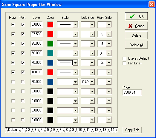
by Howard Arrington The Gann Square tool in Ensign Windows is very flexible and can be used to show trends, timing, and price levels. Gann Squares indicate possible time and price movements from important highs and lows. A start and end point are necessary to draw Gann Squares on a chart. Since the Gann Squares indicate possible values for future bars, it is often useful to the slide the chart bars to the left so there is blank space to the right of the chart bars. To draw a Gann Square on a chart move the cursor on the chart to the starting point. The starting point is generally an important High or Low on the chart. Then drag the mouse to the right until a desired ending point is reached. The start and end points will be the corners of the square. The end point is often to the right of the chart bars. Let's begin by looking at the tool's parameter form.
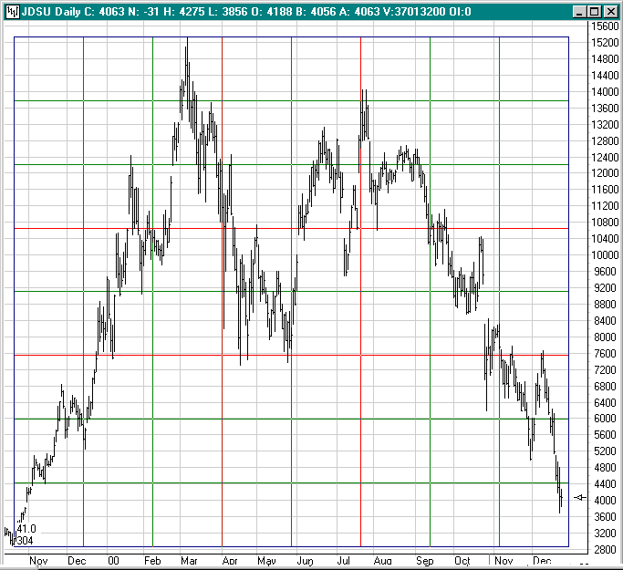
Price: A Gann Square can draw horizontal lines at the price levels shown in the Horizontal check list. These price levels are similar to those that could be constructed using the Fibonacci Price Levels draw tool. Tip: Watch for trends to change directions at the Gann Square price levels. Time: A Gann Square can draw vertical lines at the intervals shown in the Vertical check list. These vertical lines are similar to those that could be constructed using the Cycles draw tool. Tip: Watch for trends to change at the Gann Square time intervals. A Gann Square with both horizontal price levels and vertical time intervals is shown below.
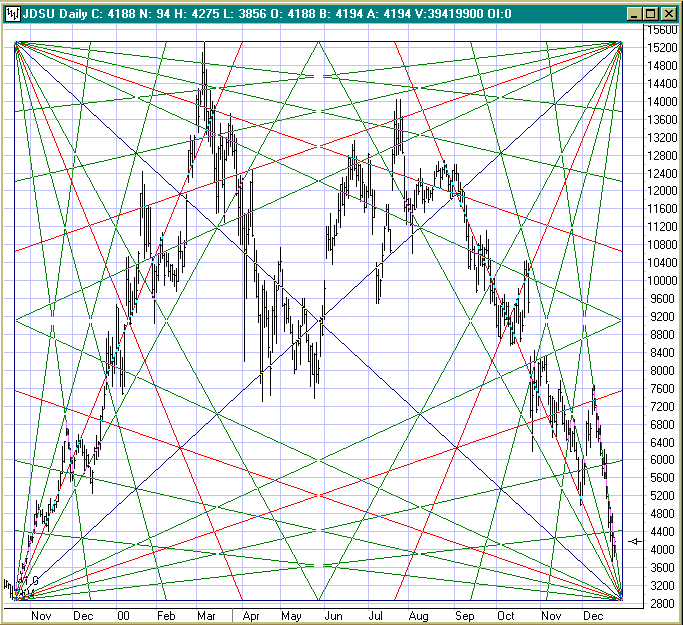
In our example, the 1/8th, 1/4th, 3/8th, and Midpoint parameter boxes were checked for both the Horizontal levels and the Vertical intervals. Thus, our square is divided both horizontally and vertically into eighths. The 3/8th and 5/8th lines are colored red. Another variation for the Gann Square is to check the Fan Lines parameter which is shown checked in the parameter form example. When the Fan Lines box is checked, the tool changes from drawing horizontal and vertical lines to drawing Gann fans from the four corners as shown below.
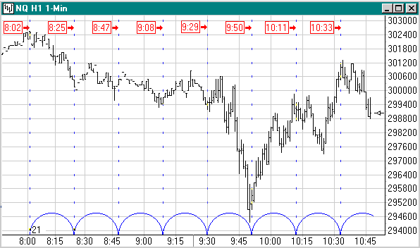
The fan lines are drawn from the corners to the same eighth points on the square's perimeter used by the horizontal and vertical lines in the previous example. The Horizontal check list will select the points used by the two fans whose vertex is on the left side of the square. The Vertical check list will select the points used by the two fans whose vertex is on the right side of the square. A common configuration for these fan lines would be to keep the two fans on the left side, but eliminate the two fans on the right side by unchecking all parameter boxes in the Vertical list except the Perimeter box. Trading tips for predicting the timing of a turn from the intersection of primary Gann angles were given in the July issue of the Trading Tips newsletter. Gann fan lines also provide price support and resistance, of which many are easy to spot in the example chart . Study Tip: by Hank Dean, Key West, FL One of the most critical aspects of successful trading is not what the direction is or why it's happening. It is the mostly overlooked when. The when can often be forecasted just like phases of the moon or the tides or waves or rhythms of any kind. Using one very simple tool, time cycles, and some common sense, you can win consistently. Without that tool it's a crap shoot. For that reason and dozens of others, and I've tried them all... I repeat, Ensign rocks! In reference to the what, why, and when, and the importance of each, please don't misunderstand me about down playing the what and why. There are so many commonly known and used sources of what (see oscillators and advanced indicator studies, volume etc.) As for why... that's as easy as keeping a couple of televisions running while you trade, ie: CNBC, Fox News, etc. They will keep you apprised of fundamentals (government reports, election antics... argg, dominating large caps, etc.) As to where to find more printed information on time cycles, there isn't much out there that I've found. Do you suppose it's something the big guys don't want you to know? Anyways, I have found bits and pieces in these sources: -Futures MagazineWhere is the Cycles tool in Ensign Windows? Click the Draw Tools button (3rd from the right). The Cycles button is the 2nd button from the right, in the 2nd row down, right next to Daily Price Lines. As you pass your cursor over it, the hint 'Cycles' pops up. When you click on it, the cursor changes to a pencil. You can and probably will run a few cycles at a time. I recommend that you color them differently, and always start by placing the ones you're least likely to adjust later, as you'll generally only be able to manually move the last one you lay down. Try this: Open the March e-mini Nasdaq contract 1-minute chart (eSignal users: NQ H1). It's all you'll need for this example. Now try this... place your pencil cursor exactly on the 8:02 a.m. EST top on Dec 12th, holding the left mouse button down... drag the pencil to the right and when you're on top of the 8:25 a.m. EST bottom release the mouse button. If you screwed it up just hit delete and do it again. Now look where the repeating cycles land: 8:47, 9:08, 9:29 etc. Do you see how they have approximately identified those small bottoms? Now for the big news. Now look after the bell, where this pre-opening bell homework really counts. IT PRECISELY IDENTIFIED THE 9:50 AM BOTTOM... AND AGAIN, THE SMALL TOP AT 10:11 AM... AND AGAIN THE TOP AT AROUND 10:33!!!!! Now combine that with On Balance Volume, MACD and Stochastics, etc. See illustration below.
Every day I check the pre-bell market first, then extend them forward after the bell. Then I lay down a permanent 22 minute cycle from 9:30 am (the bell) onward. After the bell I start tracking reversals as I trade and make subtle modifications. Understand 2 things: Now remember, cycles don't tell you the what or the why, you have plenty of other tools for that. It only says "LOOK BUCKO, SOMETHING IS PROBABLY GOING TO HAPPEN HERE>>>." That's what it's good for and as far as I know that's all that it does, but it's enough. Give yourself a few weeks using cycles before you start relying on them heavily. One neat thing about using time cycles is that it gets you thinking about the past and the future in a different way. It got me graphically tracking the small and large reversals every day early on, when they happened, how many points the move was and so forth. And it's amazing how trading days repeat themselves again and again in the same and subsequent weeks. Case in point: Take a look at the morning lows (reversals) on Dec. 7th (9:46 am), 8th (9:49 am) and then again yesterday the 11th (9:40 am) and then again finally today Dec. 12th (9:50 am)... pretty cool eh? If you haven't guessed by now, I'm geared toward index futures specifically the e-mini Nasdaq contract, and yes, you should be trading March (H) right now... unless you enjoy being crushed, and eaten for lunch. I like the NQ H1 because it's really fast and enormously profitable when trading between 9:00 - 11:30 am (the only time I trade). But you must (unless you are very well healed) use very tight stops... sometimes placing your protective stop even before your market entry limit order. 1 or 2 winners and I'm out for the day... no hanging around all day in a sideways market... but that's me. Here are some of my personal observations (for NQ), I'll kick my own butt later for making them known: - Cycles are all about trial and error... always. Good Trading Trading Tip: by Jerry Cohen -- jerrmar@earthlink.net -- 562-596-7528 After reading your January article on forward-shifted moving averages, I tried to see if single moving averages could effectively be used to stop losses. The advantage to a forward-shifted moving average, averaged over a small number of bars and used directly as a stop-loss indicator, is that it clings close to your bar plot, yet it moves up and down with the bars, helping to prevent you from getting kicked out unnecessarily. This is one possibility I have been toying with: Gann makes a point that plotting the close doesn't do you much good because it is the high or low that gets you stopped out. Therefore, as a stop-loss or entry method, use high and low n-bar moving averages shifted forward m bars. n can be 1 and it works pretty well. I find n=3 and m=3 to be good numbers for the S&P e-mini chart with 5-minute bars, during up or down moves. Ensign software makes charting easy. You color the moving average of highs shifted forward green. You color the moving average of lows shifted forward red. Now, for employing these averages as stops, use candlesticks with the simple trend indicator so they will be colored red and green. When a green hollow candle passes or is cut by the green moving average line go long. Don't if the candle is green filled or if just the wick of the candle is touching the green line. When a red filled candle passes or is cut by the red moving average line go short. Don't if the candle is hollow red or if just the wick of the candle is touching the red line. Do nothing if a red candle crosses the green line or a green candle crosses the red line. This system works fine for trends but whipsaws you out of your money during horizontal moves. Nevertheless, this system can at least help you see when you are in a horizontal move. An up or down trend is characterized by the space between the red and green lines being largely empty. A horizontal move is usually characterized by the space between the red and green lines having bars. Or the space above the green line and below the red line can also have bars, particularly when the chart has narrow bar ranges and multiple gaps due to low volume. One of the nice things about this method is that the two averages can be plotted with Ensign Windows without any special ESPL program. You use simple moving averages. You set your first average to use a High data point, and make the color of the first moving average green. Make the parameter for the 2nd line a 1 so the second line for this object is not plotted. Then you add a second moving average object, setting it to use the Low data point. Set the first moving average color red and the 2nd line parameter a 1. This gives you a green moving average of highs and a red moving average of lows, both shifted forward the amount you choose. If down moves for your market are characterized by a high degree of oscillation and up moves are typically smoother, you can set the parameters for the green and red lines differently. You can accommodate the differences in the way the chart moves up and down so you don't get thrown out of a move prematurely. Another refinement would be to use offsets to shift the green moving average line up and the red line down, but I haven't found any need for this yet. Hope this is helpful to someone. |


