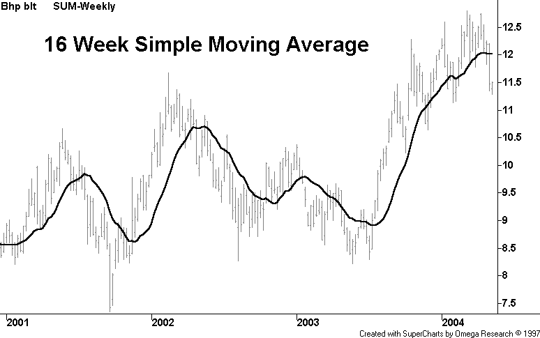
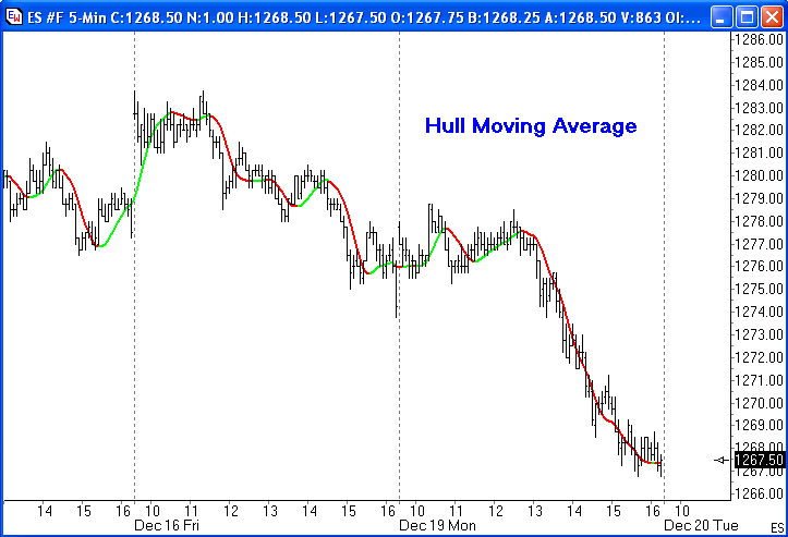
by Alan Hull www.alanhull.com The Hull Moving Average solves the age old dilemma of making a moving average more responsive to current price activity whilst maintaining curve smoothness. In fact the HMA almost eliminates lag altogether and manages to improve smoothing at the same time. To understand how it achieves both of these opposing outcomes simultaneously we need to start with an easily understood frame of reference. The following chart contains a 16 week simple moving average which constantly lags the price activity and has poor smoothness.
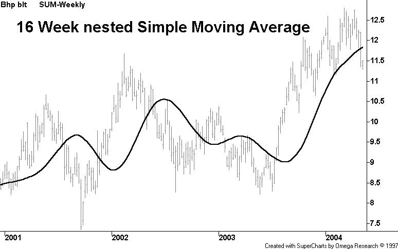
Firstly, solving the problem of curve smoothing can be done by taking an average of the average, i.e. 16 period SMA(16 period SMA(Price)). The bad news is that it causes a huge increase in lag as seen below.
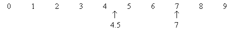
Solving the problem of lag is a bit more involved and requires an explanation with numbers rather than charts. Consider a series of 10 numbers from '0' to '9' inclusive and imagine that they are successive price points on a chart with 9 being the most recent price point at the right hand leading edge. If we take the 10 period simple average of these numbers then, not surprisingly, we will determine the midpoint of 4.5 which significantly lags behind the most recent price point of 9. Here's the clever bit…first let's halve the period of the average to 5 and apply it to the most recent numbers of 5,6,7,8, and 9, the result being the midpoint of 7.
Finally, to remove the lag we take the midpoint of 7 and add the difference between the two averages which equals 2.5 (7 - 4.5). This gives a final answer of 9.5 (7 + 2.5) which is a slight overcompensation. But this overcompensation is very handy because it offsets the lagging effect of the nested averaging. Hence the result of combining these 2 techniques is a near perfect balance between lag reduction and curve smoothing.
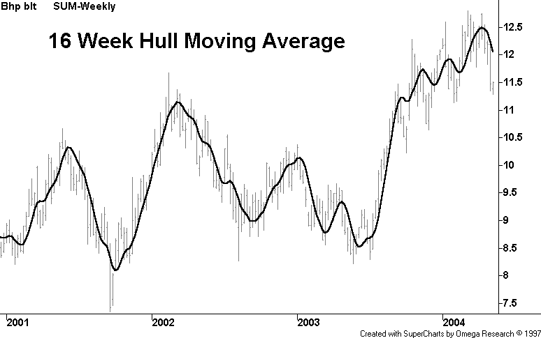
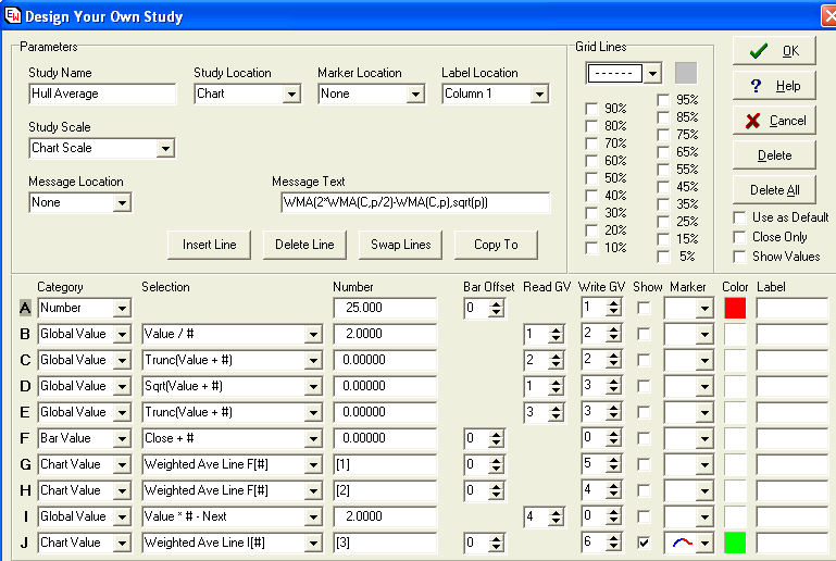
The HMA manages to keep up with rapid changes in price activity whilst having superior smoothing over an SMA of the same period. The HMA employs weighted moving averages and dampens the smoothing effect (and resulting lag) by using the square root of the period instead of the actual period itself…as seen below. WMA (2 x WMA(Price,Integer(Period/2)) - WMA(Price,Period),Integer(SquareRoot(Period))) The following formulas for the Hull Moving Average are for Ensign Windows but can be easily adapted for use with other charting programs that are capable of custom indicator construction. A template named HullAverage can be downloaded from the Ensign web site using the Internet Services form in Ensign Windows.
The HullAverage template has taken the visual of the Hull Average line one step further by plotting the study line in rising and falling colors of Green and Red using the dual color line marker on Line J. (This template requires Ensign Windows with a version date of 12-29-2005 or later.)
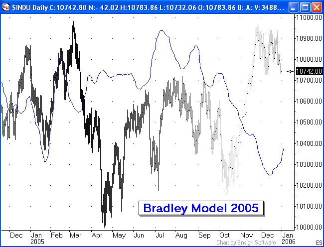
Trading Tip: by Howard Arrington An article about the Bradley Stock Market Model was published in the November 2002 issue of Trading Tips newsletter and updated in the May 2004 issue. Now that 18 months have gone by, it is time for a follow up article to document the correlation of the Bradley model for 2005 with the stock market. The Bradley model is a forecast of the market based on astrological relationships. Because astrological relationships can be defined with mathematics, the Bradley forecasts can be made decades in advance. The following chart shows how the Bradley model correlated with the stock market in 2005.
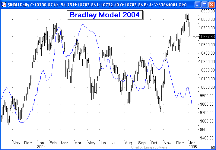
The end of 2004 and the first two months of 2005 had excellent correlation with the timing and direction of the turns in the market. However, in my opinion, it would have been difficult to trade the stock market using the Bradley model for the balance of 2005. For a portion of the summer and fall, there is better correlation with the market if the Bradley model is plotted inverted. There are three characteristics of the Bradley forecast: time, direction, and price. Each of these will be discussed. The primary characteristic to be extracted from the Bradley model is time. The model is basically a clock based on the motions of objects in our solar system. We readily acknowledge the influence in our lives of the daily rotation of the earth, and the monthly orbit of the moon, and the cycle of seasons from the annual orbit of the earth around the sun. But beyond those three accepted astronomical clocks, skepticism increases that life on earth is also influenced by other astronomical bodies. It is hard to accept that other astronomical bodies have any influence on the business cycles of the economy of the United States or the world. But that is what the Bradley model is attempting to show. When the timing of market turns is in synch with the Bradley forecast as was the case for the turns in December 2004 (top), January 2005 (bottom) and February 2005 (top), the forecast can be very impressive. As is shown in the 2005 chart, the market and the Bradley forecast can be out of sync. For example, the two turns in August 2005 were well aligned for time, but out of sync for direction. The market put in a top in mid August when the forecast was for a bottom turn. And the market made a bottom swing at the end of August when the forecast was for a swing top. When this happens, the forecast is described as being 'inverted'. The timing of the turns is still well aligned or correlated. It is the direction into these turns that is inverted. Why does inversion happen? Answer: I do not know and I have not found a good answer from those who regularly work with the Bradley model. Is there a way to know in advance when inversion will happen? Answer: No. You can suspect the model is inverted when it is happening, and still take advantage of the time forecast. The third characteristic is price, and this should have a low priority in comparison to time and direction. The Bradley data values are in the range of -200 to 200 and thus to plot the Bradley forecast, the data set has been resized and repositioned so that it shows on the INDU chart as an overlay. The Bradley curve has been stretched and shifted vertically until the curve fit nicely on the INDU chart. How the curve is shown on the chart is completely arbitrary for the convenience of seeing the Bradley curve near the market data. At times there is good correlation in comparing the size of one Bradley swing with another and seeing a similar ratio in swing amplitudes in the market. At other times, there is no price correlation. The 2005 Bradley model suggested the annual top of the market would be in July 2005. There was a swing high in the summer, but it definitely was not the top of the market for 2005. The stock market's 2005 top occurred in March with a retest of that top in November 2005. Be sure and read the other two articles about the Bradley model to see other examples where there was better correlation between the forecast and the market than was experienced in 2005. Neither article shows the full correlation for 2004 so the 2004 chart is shown here.
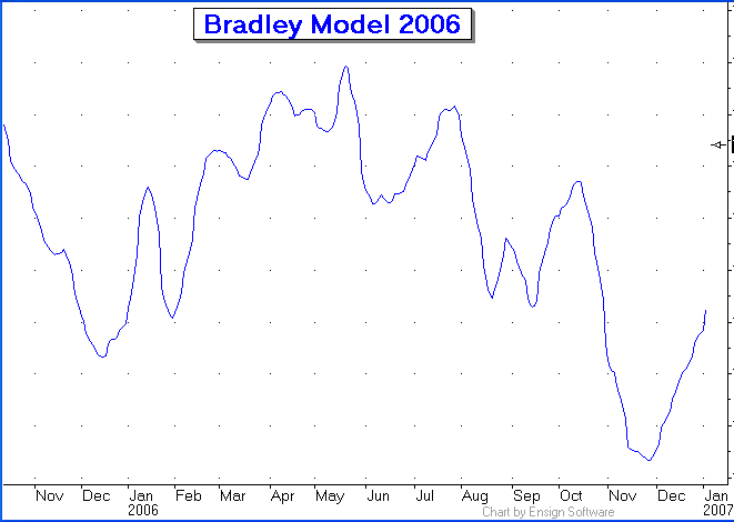
This update on the Bradley model concludes by showing the forecast for 2006. Only time will tell whether the market and the forecast will be well correlated, or inverted, or down right useless as a tool for trading the stock market. The forecast does not show a price scale on purpose. Use the curve primarily for timing the turns, and then secondly for the direction into those turn dates. In general the model shows an up trend for the first half of 2006 and then a down trend into Thanksgiving. However, the forecast into the end of 2005 appears to be inverted, so the 2006 forecast may also be inverted in part or in full.
|