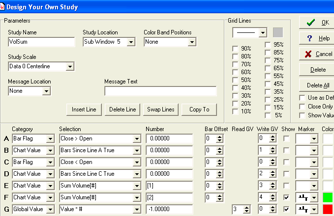
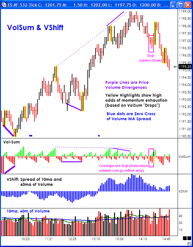
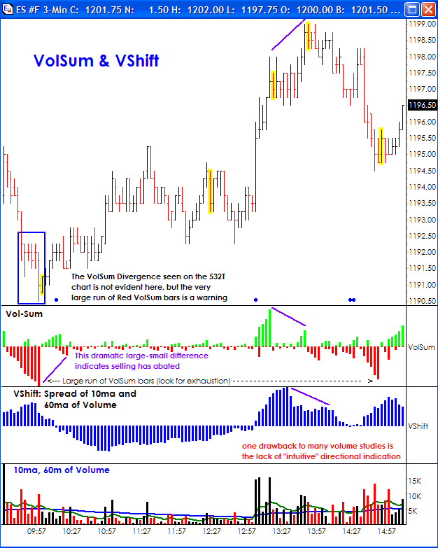
by Ana Maria Gallo Aside from price itself, volume represents the commitment of traders to take a position. Richard Wyckoff referred to volume as the "cause" and price the "effect", indicating that to him, volume leads price. Over time many indicators have been created to gauge volume strength: Accumulation Distribution, Chaikin Oscillator, Money Flow Index, On Balance Volume, and simple moving averages or rate of change indicators on volume. All have their uses and are worthy of study by the student of volume. While time is often on the side of a swing or position trader, who can evaluate volume directly or through comparison using such indicators? The day-trader needs a quick, intuitive, and preferably, visual confirmation that the tide has likely turned. Fast markets need rapid decisions and during the torpor of a slow market, small clues help alert the trader to "pay attention". Momentum bars using tick are particularly useful to day traders as they reflect price speed. Unfortunately, as for minute based bars, volume for tick bars is also flat looking and difficult to quickly read. To this end, the VolSum indicator was created to provide a quick visual look at volume behavior relative to price that might otherwise be lost. This indicator is also useful on intra-day minute charts, and perhaps surprisingly on constant volume charts. A suggested user-modification for the later is to alternatively experiment using Tick Count rather than Volume. This can be done by a small change on the VolSum DYO. VolSum: Volume Summation The Volume Sum DYO tallies of volume for a run of UP (or DOWN) bars, draws a histogram of the running total, and resets itself to zero when the run completes. Doji bars (i.e. Close=Open) are counted as part of the run in progress. This means there will be places where the histograms overlaps. This is reasonable as a Doji indicates indecision and the price pressure volume represents could flow either way. Note too that a value axis is not shown. This is by intent, as the relative values and shapes are what are, in my opinion, of best use in this tool. However, when used on larger intraday time frames (e.g. 15-minute), the peak VolSum bars can be used to gauge potential "balance" volume required to absorb the prior buying or selling spree.
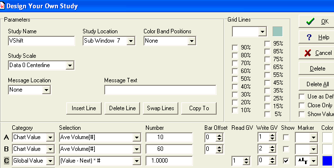
VShift: Volume Shift Alert One of the most pleasant aspects of the www.dacharts.com trading community is the sharing of ideas, charts, and, of course, templates. "Tricky", a fellow trader in the dacharts.com community, wrote a group of indicators that highlight a bar when VolSum indicates there is a high odds of price exhaustion. This alert is shown in the examples and is included in the template below. For those who have long used simple moving averages of volume, I present an indicator I call VShift, which is a simple spread of two volume moving averages, the shift from below zero to above zero indicating a momentum change and marked by a small blue dot at the bottom of the chart.
Examples: The VolSum, VShift, and Price Exhaustion alerts have all been collected on one template for Ensign Windows users. Use the Internet Services form to download the VolSumVshift template from the Ensign web site.
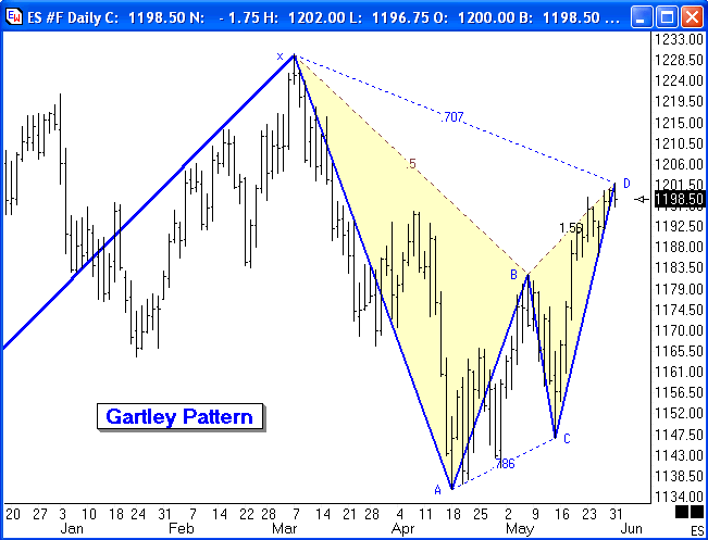
Trading Tip: by Howard Arrington One of the formations that Larry Pesavento looks for is the Gartley pattern, which is named after H. M. Gartley who wrote 'Profits in the Stock Market' in 1935. The following chart shows a Gartley Sell formation.
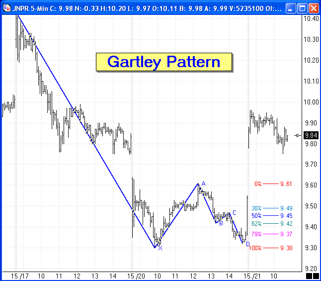
The market has had a sizeable move up to put in a top at point X, which is now considered a potential turning point. The Gartley pattern is one with an initial correction to point A, and then a 3 wave retest back towards the turn at point X. The 3 waves back up are labeled in the example as B-C-D. There should be symmetry in the retrace, namely A-B equals C-D. Point D should be around 0.618 of the X-A distance. The example shows point D at the 0.707 retrace distance. The principle is to sell point D with a protective stop above point X. Keep in mind you do not initially pick X as the top. You wait for selling to move the market to point A, and then sell on the retracement approach back to X, looking for a three wave retracement pattern that fulfills a 0.618 retracement distance. The inverse pattern at potential bottoms would be the Gartley Buy formation. Buy the retest approach to the bottom turn at the 0.618 retrace level, with a protective stop below the bottom turn price. The next example shows a very nice move up after the Gartley Buy formation.
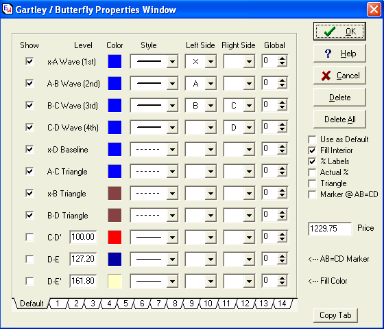
The Gartley formation is easily marked using the Gartley / Butterfly draw tool in Ensign Windows. Here is the property form for this tool.
The pattern is marked by clicking the left mouse button down at point X, drag to point A, release the mouse and click on point D. The tool will automatically find points B and C between points A and D, and draw the lines as shown, fill the two triangle interiors with a shade color, and label the retracement percentages. The tool could also show extensions of the C-D leg, or reactions from point D to create a D-E line that is parallel to the x-A line |