by Howard Arrington What is over 500 printed pages in length and been 5 years in the making? The answer is the Trading Tips newsletter, which is beginning its 6th year. When readers asks if past newsletter issues are available, I realize they have not yet discovered this informative resource on the Ensign web site. This table lists some of the best articles published in past Trading Tips issues. Click on a link to read the full article.
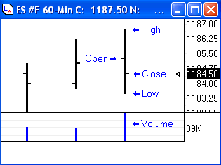
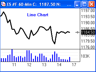
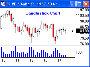
Trading Tip: by Howard Arrington A chart is the primary tool used by technicians to analyze a security. A chart is a convenient graphical way to represent the time, price and volume properties of a trade event. This article will show the geometrical relationships for various chart types. Four basic properties of a trade:
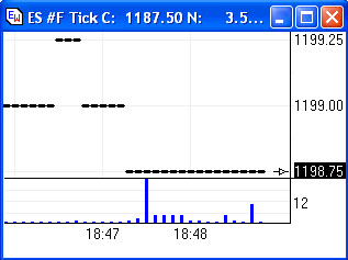
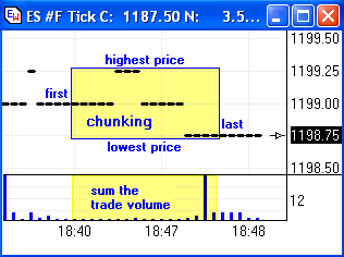
The most common way to present the above information about a trade, is to plot trades on a graph where time is the horizontal axis, and price is the vertical axis.
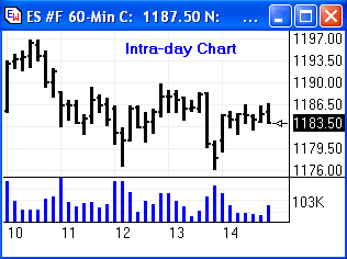
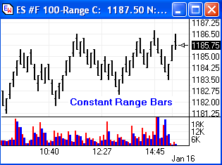
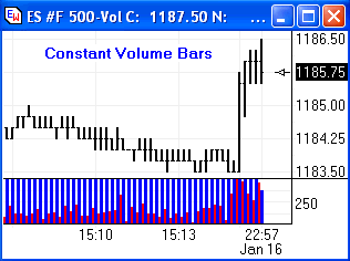
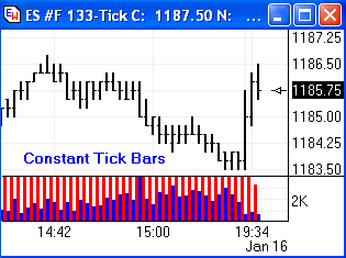
The four chart types shown above share in common the four basic properties of a trade. Each chart type forces one of the basic properties to be a fixed unit for each bar in the chart. The three other basic properties will of necessity have a variable size. This table summarizes the chart types and the four basic properties of time, price, volume and trade event.
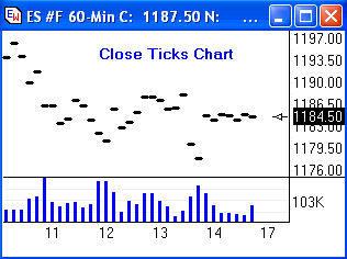
Display Formats: The chunked group of raw ticks form a bar, which can be displayed using the following variations. The display variations can be used with any of the chart types.
There are other variations in the presentation of the trade information. Each variation emphases some particular property or characteristic of the underlying data, often at the expense of ignoring or hiding other characteristics. So this article is by no means complete and exhaustive. Some variations that were not covered include: Renko Charts, Swing Charts, Heikin-Ashi Charts, Average Candle Charts, Point and Figure Charts, Three Line Break Charts, Price Histogram Charts, and Market Profile Charts. Beginning traders may wonder whether one chart type or display variation is superior to another. The answer is basically 'No'. All chart types have their roots in the same trade information. Every variation will have traders who use that variation successfully and exclusively. Having said that does not mean that there isn't a popularity bias. Here is my opinion about the popularity of the different chart types and display variations.
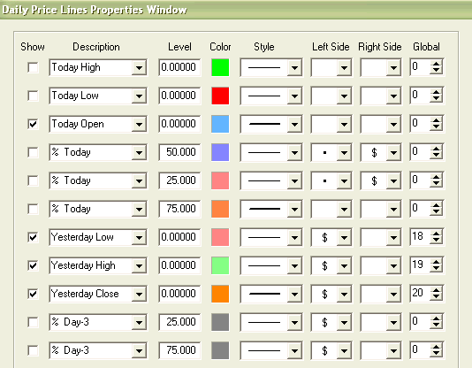
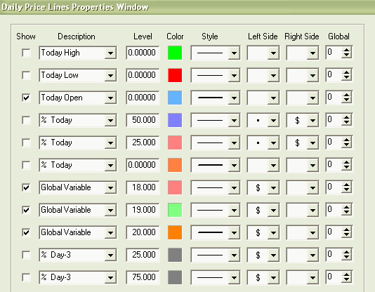
Trading Tip: by Ana Maria Gallo I recently noticed that my small volume charts didn't show the same yesterday's high (YH), low (YL), and close (YC) values as shown on my minute charts. I keep the maximum bar count small and in the case of the YH and YL, the data to find those values was no longer in the chart data set! Rather than needlessly increase the max bars, and in the process make a resource intensive chart, I created a tab on the Daily Price Lines drawing tool that writes YH and YL as Global Values (GV). Additionally, I discovered that because the volume bars close out with volume, and not time, that the close shown on those charts didn't match the regular trading hours close. So, I added YC as another GV. The resulting setup is shown below. I can then draw the Daily Price Lines on my 5 minute chart and select this predefined setup so that the correct real time hours (RTH) YH, YL, and YC are written:
Mail Bag: 'As always, thanks for your patience, help, and continued enhancements to Ensign, and the value you create in this incredible software package.' -F. Del Casino 01-03-2005 'Can't tell you how grateful I am for the really quick reply and the fantastic support. Many thanks for your time and help.' -N. Rayne 01-03-2005 'I think you have really hit the best template with the Study Consensus, and also your CCI with Auto-Trendlines will do more than Woodie's CCI setup.' -J. Riffel 12-28-2004 'Being able to chart the tick chart speed (see Market Speedometer) has added a great deal of value for me, very nice!' - J. Tybrand 12-23-2004 'The December issue must rank as one of the most outstanding "Tips" newsletters, ever! You've illustrated in a neat, logical, and most importantly, easy to understand way just what linear geometric projections (i.e. lines) are. By putting them in a global perspective, you demonstrate how this basic concept -- geometric projection -- can be displayed in many ways using tools that many don't even believe are related. Also, thanks too for the links to the "speed bar". I saw it shown in a chart but couldn't figure out how to do it. I love it! I am now exclusively using volume bars for intra-day trading (aside from a glance at a 10 min. or 2 min. bar chart) and will experiment with it over the holiday. Best wishes to you and my gratitude for a really "swell" program.' -A. Gallo 12-23-2004 'Thanks very much for the great software and the new history data. Its a little scary seeing the big picture though, where things have come from and where they could go.' -D. Morahan 12-22-2004 'I must admit that after many years of using various other software, I find Ensign to be the most dynamic of them all. I can't tell you how pleased I am with your product. As President of the Society of Market Technicians in Washington DC, (www.markettechnicians.org), I have recently briefed our membership about the technical wonders of Ensign, in addition to your unbeatable price. I'm absolutely sure you'll be seeing more new subscribers from the DC area in the coming months as subscriptions from your competitors expire. Thanking you in advance.' -K. Armstrong 12-21-2004 'Your programming is the best. Years ago I took a course from the father of Stochastic, George Lane. He introduced me to Ensign then. The innovations you've made with Pesavento Patterns tools makes trading enjoyable. The key is to put all these tools to use, quickly and properly to make money. And your Fibonacci programming tools work and are easily employed. I always check the Fib ratios on my Excel calculators (just as a fail safe), and the match is on the money. When one trades a lower time frame it is necessary to fly the same path as the larger time frames. I can plot the larger time frames trend line over the tops of the shorter one and get some unbelievable probability. Love this stuff, great workmanship.' -W. McGrath |