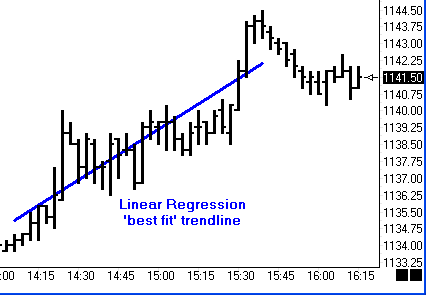
by Howard Arrington A Linear Regression (LR) line is a trend line that is drawn mathematically so that is represents the 'best fit' for the data points it passes through. The formulas use the least squares method to determine the line's placement. This minimizes the distances between the data points and the trend line. The algebraic expression for a straight line is: y = b * x + a where b is the slope of the line and a is the y-intercept. The linear regression formula calculate both the b and the a values. 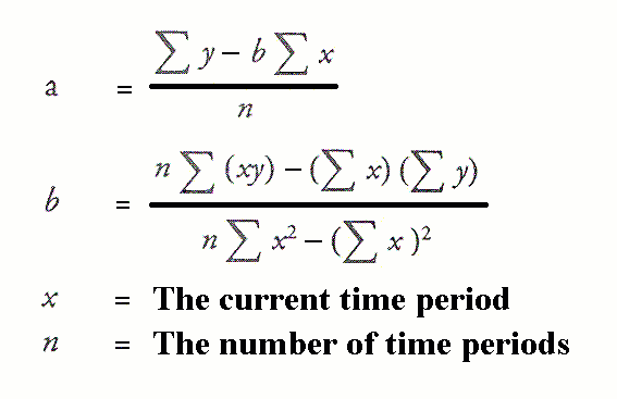
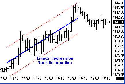
One technique is to draw equally spaced channel lines at a distance based on Standard Deviation. The Linear Regression draw tool in Ensign Windows has a multiplier parameter for the Standard Deviation offset. The following example shows red channels lines drawn at 2 times the Standard Deviation. Prices that stay outside of the regression channel indicate a change in trend.
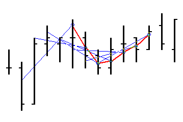
The next technique that is based on Linear Regression trend lines, is to calculate a Linear Regression line for every set of n bars, and determine the price where the trend line intercepts the last bar in each data set. Thus, one data point is determined for each bar in the chart, and these data points are then connected to create a Linear Regression curve, quite like a moving average. The next chart illustrates several LR lines that each span a set of 5 bars. The price where the LR line intercepts the last bar in each set of 5 bars is marked with a dot. These intercept points are then connected by the red line to form a curve.
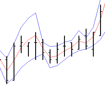
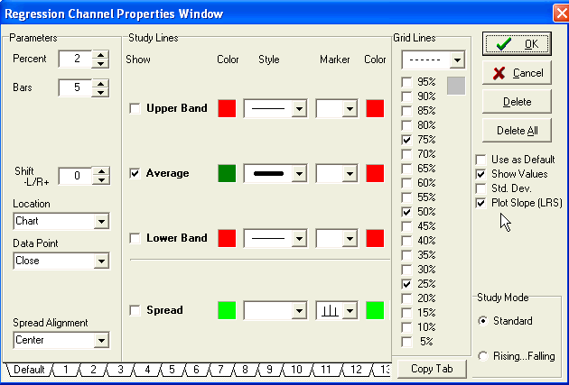
The study in Ensign Windows which is based on the above technique is called Regression Channel. The center line is calculated as illustrated in the prior example. Then bands are added whose distance from the regression center line is based on Standard Deviation.
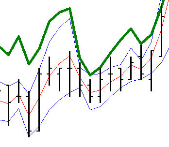
The last technique discussed in this article is to plot the Slope of each Linear Regression trend line that is calculated for each set of n bars. In our earlier example with several LR lines, each LR line has a slope. Some have positive slopes wherein the lines are ascending. Some have negative slopes wherein the lines are descending. A change in the slope can be an early indication that the trend is changing direction. This example shows the Regression Channel, with the Linear Regression Slope study plotted in green.
The Linear Regression Slope (LRS) is a plot of the b values calculated for each set of n bars. In the last 3 illustrations, n had a value of 5. This small set size makes for a choppy channel and a choppy LRS. The lead article in this newsletter is a better example of how the LRS will look on a chart, and the set size parameter will be more useable when in the neighborhood of 10. Ensign Windows users who would like to investigate the Linear Regression Slope study would select the Regression Channel from the study list, and check the Plot Slope (LRS) check box on the study property form. The LRS will be plotted instead of the Regression Channel. Upper and Lower bands may be added to the plot.
Mail Bag: 'The addition of volume to the Tick charts has become an invaluable tool. As I believe volume is often a leading indicator of price, I use volume extensively to make decisions. With the reduced ES e-mini volume of late, being able to monitor volume on a tick chart with the Chaikin indicator study had added a whole new dimension to trading with tick charts. Additionally, the Volume bar features has again added another dimension to viewing price action and, along with contract volume on ticks, aids greatly in making trading decisions.' -A. Gallo 06-28-2004 'Thank you for this product as well as your commitment to traders and their success in the markets. The Statistics page is one of many examples of this. What an amazing tool at my fingertips! It has aided me in selling the high of the day, on several occasions this year, as this was made for months between 12:30 and 1:00 pm. This still occurs from time to time but the market environment has changed some. It has gotten more choppy and less trendy. My trading style has changed to accommodate this and to take advantage of the large overnight gaps that are occurring in the grains markets. So most of my positions are now being taken or exited near the close.' -J. Shea 06-19-2004 'Thanks for providing us with the very best charting software available and with absolutely the best support. Trading is a hard nut to crack..... Ensign Software gives me the edge.' -B. Davis 06-16-2004 'Impressive support! Thanks you for the amazing response. What you've implemented will go a long way to making the trading strategy much easier for the client to use. I'm sure she will be impressed by what you've done to help out.' -I. Vanier 06-12-2004 'I have received your latest newsletter where you mentioned Bradley siderograph and it seems to me that you are interpreting it somewhat incorrectly. You wrote "It denotes patterns, trends and the timing of swing tops and bottoms." Consensus among financial astrologers is that Bradley siderograph indicates only turning points within about +/- 6 days and quite often they are inverted. I don't know how familiar are you with astrology and with how BS is calculated but it can not reliably predict the direction, tops, bottoms etc. But those turning points are quite often correct (if you are investing long term) even when sometimes inverted. Actually, there were a number of different models of the siderograph created in recent years and they were tuned to different markets. But even as an astrologer I have to say you will get more useful information just by putting a moving average on the chart.' -A. Klouda |