by Howard Arrington A couple months ago I was studying a set of intra-day charts when it dawned on me that the high of the day was occurring about the same time of the day over and over again. That started the wheels turning as I wondered if there was any statistical significance to that impression, or whether it was just a fluke for the set of charts I was looking at. It did not take long to create a very nice tool in Ensign Windows that would display statistical results for any symbol using 30-minute intra-day and daily chart data sets. Let me begin by explaining how the statistics are presented, and then share some very interesting discoveries.
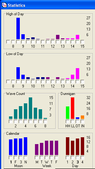
These results are from analyzing the last 60 trading days of JNPR (Juniper Network) using 30-minute bars. The first frame shows when the High of the Day occurred broken down into 30 minute periods. The time scale shown is for the Central time zone. I found it very interesting and significant that nearly 50% of the time the daily high for JNPR occurs in the first 30 minutes of trading, between 8:30 (market open) and 9:00 am. This is indicated by the first tall blue bar, whose scale height is labeled as 27 days out of 60 days. Another 6 days had their daily high occur in the 2nd half hour period from 9:00 am to 9:30 am. The 2nd frame shows when the Low of the Day occurs. This graph shows the low of the day is most likely to occur in either the first half hour of trading, or the last half hour of trading. The height of the 8:30-9:00 bar and the 14:30-15:00 bas appears to be equal at 13 days each. I feel this is useful information to know about the characteristic of a market. The frame labeled Wave Count shows how many swings occur each day on the 30-minute chart. Apparently the JNPR chart has 5 swings intra-day 25% of the time. The next most common swing count is 4 intra-day swings. The frame labeled Dunnigan is classifying each bar as being either a Higher High (HH), Lower Low (LL), Outside range (OT), or Inside range (IN) bar. A higher high bar is one which has both a higher high and a higher low than its neighbor on the left. The lower low bar is the opposite of a higher high bar. The lower low bar is one which has both a lower low and a lower high than its neighbor on the left. An outside range bar is one which has a higher high and a lower low when compared to the bar on the left side. The inside range bar is the opposite of an outside range bar. The inside range bar has a lower high and a higher low than its neighbor. Of the last 60 trading days, 32 of them were Lower Low days, giving a quick visual that the bias for the JNPR market has been down. The frame labeled Calendar is counting bars according to the weekly phase of the moon (1st qtr, Full moon, 3rd qtr, and New moon), also according to the day of the week (Monday through Friday), and according to a four day modulo on the day of the year. When one is considering 60 trading days, one naturally expects to see uniform levels in the calendar categories. So the question is raised, why even have these calendar statistics? The reason is found in the small check box that is at the base of each of the graphs bars. When all check boxes are unchecked, then the statistics obtained are from the entire set of 60 trading days. But, if a box is checked, then the statistics are specific to the bars that belong to the checked column. Let me illustrate by checking the box for Monday (M in the Week set). This image shows how the graphs change.
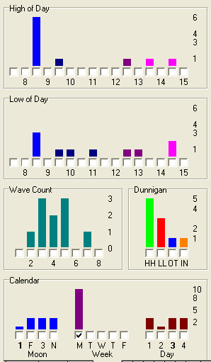
The first point to be made is that the bars for the other days of the week have disappeared, as expected. Apparently in our data set of 60 trading days, 10 of them occur on Mondays. The reason it is not 12 out of 60 is because two of the Mondays in the past two months were holidays, such as President's day. Let's make a quick run down of the statistics when considering ONLY Mondays. 6 out of 10 times the High of the Day was made in the first 30 minutes of trading. The Low of Day statistics are similar to the earlier observation. There is a BIG change, however, in the Dunnigan bar distribution where 50% of the time the day was a Higher High day in a market where the general statistic has a bias of being a Lower Low day 53% of the time. This is a significant characteristic I did not know before, and will be helpful in my preparations for trading following a weekend. The Statistics Screen allows you to place a check mark in many Categories to FILTER the results. For example, if I put a check mark in the 'T' Tuesday box (in the Calendar panel), then all the Statistics on the screen will include only the Tuesday bars. The Logical 'OR' and 'AND' selection box effects the results only when you have selected multiple check boxes. For example, if I place a check mark in the 3rd Day box and the Tuesday box, and the Logical selection is set to 'OR' then you will see all results that were either a Tuesday bar, OR a 3rd Day bar. If the Logical selection is set to 'AND' then you will see only the results that were a Tuesday bar, AND also a 3rd Day bar. The 'OR' and 'AND' selections only effect results when you have placed a check mark in more than one box. The 'OR' selection will give you results from all the selected check boxes. The 'AND' selection is more restrictive and will give you results in only the cases where all the conditions are met. More statistics are displayed on the Statistics form than were illustrated in the first two images. The next image shows the remainder of the statistical results.
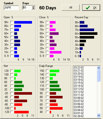
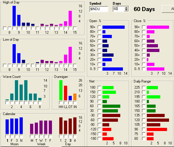
The Symbol edit box is used to select any symbol for analysis. The statistics can be obtained for any stock, futures, or index. The next control selects the number of days to include in the analysis. The example for this article is using 60 days. More data can be analyzed, but a balance needs to be considered. Choosing to include days in the far past may be irrelevant to the characteristic of today's market we seek to discover, so I caution against having too many days included. On the other hand, choosing to look at too few days may show results that do not have any statistical significance. The frame labeled Open % shows that 18 days out of 60, JNPR opened in the top 10 percent of its daily range. This dominance to open near the top is not surprising because two similar statistics were discussed in the previous section: 1) The High of the Day tends to occur in the first half hour of trading, and 2) the Dunnigan count shows a dominance of Lower Low days meaning that JNPR has had a downward bias. The frame labeled Close % shows the distribution of the close across the daily range. The longest bar is counting the number of times the close was in the 10 to 20 percent of the daily range. As I think about it, this seems logical. Often the low of the day is put in, but as day traders close out their short positions near the end of the day, the market recovers and is more likely to close off the bottom in the 10 to 20 percent range than it is to close in the lowest 10 percent band. Again, this is a useful and interesting market characteristic to know. Look at each of the graphs and ask yourself that the graph is telling you, and can you think of the reason why. The more you look, the more you will discover. The frame labeled Recent Day is showing the distribution of time spent in each of the 10 percentage zones across the daily range. This frame is showing a profile for just one day, the most recent trading day. One cannot tell from the graph whether the recent day was a higher high or a lower low day. What the graph is showing is that very little time was spent trading in the bottom third of the daily range. Most of the trading occurred above the midpoint of the daily range. The frame labeled Net is showing a distribution for the daily change in price. While JNPR had a couple big Up days of gaining a $1.20 or more, it had several more big Down days of losing a $1.20 or more. The most dominate action is to close nearly unchanged from the prior day's close. There are more red bars than green bars, so again we can conclude the bias has been downward. The frame labeled Daily Range is showing a distribution of the size of the daily range. Narrow range days of 50 cents or less occurred 8 times in the last 60 days. Big range days of $1.50 or more occurred 6 times, or 10% of the time. A typical daily range would be in the middle of the graph, such as from 80 cents to $1.20. The final panel shows a list of the days used in generating the statistics. Remember that any one of the columns can be singled out for private analysis. Then it is very helpful to know the dates that make up that bar's statistics. Let me illustrate by singling out the 9 days that constitute the biggest red bar for the largest negative net. This is done by checking the box adjacent to the -120 bar of interest.
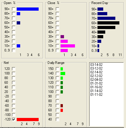
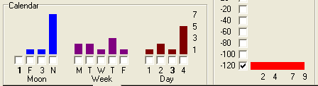
The list shows the dates for the 9 largest down days in the past 60 trading days for JNPR. Two of those dates occurred a week ago on March 12th and March 14th. Humm...... isn't that interesting that the SAME two dates in February were also big down days, AND 28 days earlier in January were also big down days. It is really uncanny, in my humble opinion, that January 14th and 16th, February 12th and 14th, and March 12th and 14th would all show up on this statistical list for biggest down days. I hope you can start to see and appreciate the power and flexibility of having and using a tool like this to analyze a symbol's data set to discover hidden characteristics. I have learned a lot about JNPR I was not previously aware of as I have used the statistics tool in writing this article. For example, I was not aware of this last discovery about the dates for major down days and the apparent 28 day cycle of when they occur. Lest we drop a really important discovery here by treating it too lightly, let me show the image of the Calendar distribution for these 9 biggest down days.
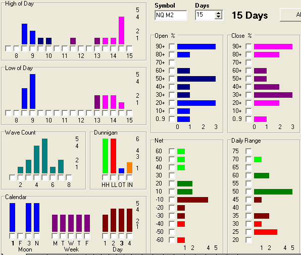
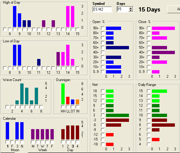
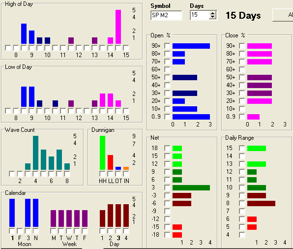
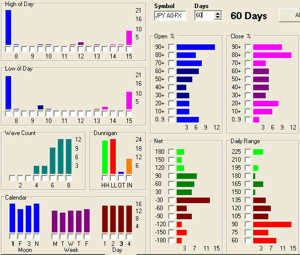
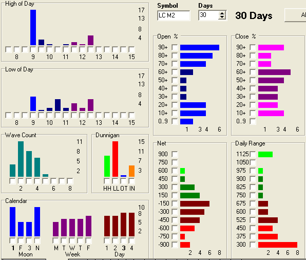
Seven out of the 9 days occurred in the week of the New moon phase! I do not see any bias as to the day of the week M-F, but behold there is a bias for the 4 day modulo. The majority of the big down days occur on the 4th day in the rotation. I feel like I am being armed with new knowledge about when big down days are likely to occur in JNPR. A big down day will have a greater likelihood to be near a New Moon, on those days that are day 4 in the modulo rotation, which might be any day of the week. I for one will be watching when that combination comes around in another 28 days on April 9th and 11th. The statistical weakness of the results presented in the last two paragraphs is that the data set has only 9 members. However, you get the idea of what can be done with a powerful tool like this which extracts statistical results from chart data sets and presents it in a clear and concise graphical way. Now that you understand how to read the graphs, let me show statistics for several symbols. On each illustration, note the Symbol and the number of days in the analysis. Enjoy.
The Statistics tool featured in this article is found in the latest version of Ensign Windows, which can be obtained from the Ensign Software web site. Go to www.ensignsoftware.com and download Ensign Windows. Data for the analysis can be downloaded for free from the Internet and the program can be used without having a subscription to one of the supported data vendor feeds |