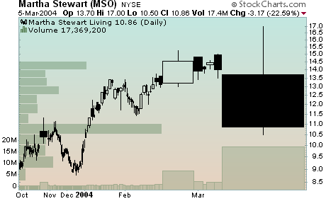
CANDLEVOLUME AND THE TRIX
CandleVolume charts are a new addition to StockCharts.com making their debut just this weekend (See the "Web Site News " section below for details). They are constructed just like regular candlestick charts with upper and lower "shadows" as well as filled and hollow "real bodies". Their distinctive characteristic is the width of each candlestick, which varies based on the volume for that particular time period. The higher the volume, the wider the real body of the candlestick. Here's an example chart ripped, as they say, straight from the headlines:
As you can see, the days where volume was extremely high really stand out on a CandleVolume chart!
One thing to be careful about however is to realize that the horizontal (time) axis is no longer linear - i.e. every time period is a different width. That can throw off traditional trendline and chart pattern analysis and, while we do plot indicators and overlays on these charts, they get "stretched and squeezed" also along the horizontal axis.
Another great tool that StockCharts.com is introducing this week is the TRIX indicator. The TRIX is a triply smoothed momentum indicator similar to the Rate-of-Change (ROC) indicator and the MACD. Like the ROC, it takes a single parameter which is the number of periods to use in the calculation. An optional second parameter is used to create a "signal line" MA that overlays the TRIX and can be used for cross-over signals.
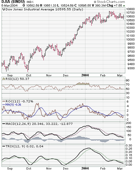
The TRIX is an unbounded oscillator that moves above and below the zero line. By using three layers of exponential smoothing, the TRIX removes many "unimportant" price movements and help you focus on the longer-term trends. By the same token however, the TRIX can lag other indicators significantly. It is most useful for confirming signals generated by more "skittish" indicators like the ROC and RSI.
- Chip Anderson