A LONGER-TERM MARKET VIEW
Daily charts can be used to fine tune entry and exit points, but they should be interpreted within the context of what weekly charts and indicators tell us. For example, some shorter-term indicators show the market to be overbought, but the weekly chart implies that another leg of the bull market is just beginning.
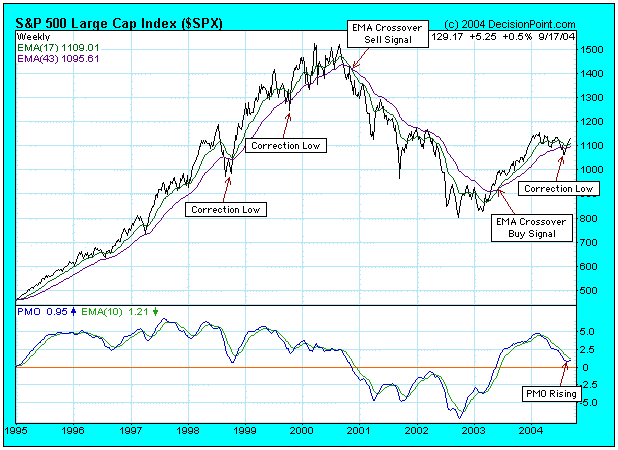
At the beginning of this year the market began a corrective phase that lasted about eight months, climaxing with the shakeout selling into the August lows. As you can see on the chart, bull market correction often conclude when the price index dips below the moving averages. The fact that prices are now back above the moving averages (which are also rising), is a good sign that the correction is over.
Another good sign is that the Price Momentum Oscillator (PMO), which topped in overbought territory in the first quarter, has now bottomed near the zero line. You can see how the PMO remains above the zero line during bull market corrections -- in bull markets the zero line is an oversold level for the weekly PMO.
There is nothing not to like on this chart. A lengthy correction has been successfully concluded and the market environment is very positive. I have no opinion on how long or high the rally will go, but I assume it will last for at least a couple of months. We want to see the PMO continue to rise and cross above its 10-EMA. If the PMO turns down below its 10-EMA, it would be a strong sell signal.
- Carl Swenlin