Chart Patterns Tutorial
Traders have debated the merits of "technical
analysis" versus "fundamental analysis" for
years. In reality, most traders probably do not
make such a rigid distinction between these two
approaches to market analysis and use some of
both in making their decisions.
Fundamental analysis studies factors such as
supply, demand, weather, political developments,
economic reports and the like to come up with
their forecast for potential price direction.
But many traders do not have access to all of
the vast amount of fundamental information
available nor do they have the ability to
interpret the significance of much of this
information on the market they are trading.
Conclusions from fundamentals tend to be quite
subjective.
Instead of trading to digest all of this
fundamental information and convert it into an
opinion on prices, those who use technical
analysis believe that everything that is to be
known about a market is incorporated into one
thing, price, and look only at data generated by
the action of the market itself. The technical
trader's main resource is a price chart, which
shows visually what has happened to prices
historically and, based on past market action,
what is likely to happen when the same
conditions arise in the present.
Even the staunchest advocate of market
fundamentals is likely to refer to a price chart
before making a trade, if for no other reason
than to get some perspective on how current
prices fit into a market's price history. By the
same token, even the most dedicated follower of
technical analysis is likely to keep in mind the
importance of key fundamentals such as natural
disasters, political upheavals, major economic
reports, etc.
This trading tutorial focuses on the basics
of technical analysis, which involves several
underlying assumptions:
- All fundamentals or any other inputs
known to the market are reflected in price.
- History repeats itself so that a study
of what prices did in the past can provide
clues about what they will do in the future.
- Prices tend to move in trends – up, down
or sideways – and changes in existing trends
provide potential trading signals.
Technical analysis can be rather simple or
quite complex, depending on the capabilities you
have to manipulate the market data. The
"primary" trading tools include basic chart
patterns, such as triangles, double tops and
bottoms, head-and-shoulders, flags, pennants
and, of course, one of the most basic, yet most
powerful, trading tools, the trend line. As long
as you have the relevant price data, these basic
tools do not even require a computer although a
computer does make analysis much faster and
easier.
Charts for traders
Over the years traders have developed a
number of different types of charts in an effort
to get a better view of price action. Old chart
techniques are resurrected and new chart ideas
devised, but the following types of charts
continue to be the most widely used.
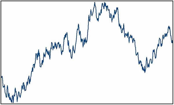
Close-only charts – As its
name suggests, only the close for a time period
is plotted, and a line connects the dots of
these closes. These work best for an overview,
especially over a long period of time.
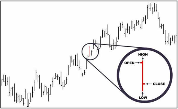
Bar or line chart – Perhaps
the most popular type of chart, the bar chart
adds new information for the trader, showing the
high and low prices for a time period in
addition to a horizontal notch on the right side
of the vertical bar indicating the close. Many
chart services also show the opening price with
a horizontal notch on the left side of the
vertical price bar.
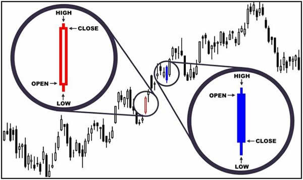
Candlestick chart – This
concept was introduced to western traders in the
late 1980s and adds yet another dimension to the
standard open-high-low-close price data to make
the price action during a period more visual at
a glance. The open and close have the most
significance with the difference between the two
making up the "body" of the candle. If the close
is higher than the open, the body is usually
shown as clear or white and indicates the market
gained strength during the period – the bulls
won the day. If the close is lower than the
open, the body is usually black or dark and
indicates the market lost strength during the
period – the bears won the day. Price action
outside the range of the body is shown as
"tails" or "shadows" and gives further clues
about price movement during the time period
specified.
The Basic Tool: Trend lines
No matter what chart type you use, the first
thing you should try to determine as a trader is
the trend of market. You can use all kinds of
clever ideas and sophisticated techniques to
arrive at your trading decisions, but a basic
building block of whatever trading style you use
should be trend analysis.
Here is what respected technical analyst John
J. Murphy says about trend lines in his
excellent book, Technical Analysis of the
Futures Markets: "The importance of trading
in the direction of the major trend cannot be
overstated. The danger in placing too much
importance on oscillators, by themselves, is the
temptation to use divergence as an excuse to
initiate trades contrary to the general trend.
This action generally proves a costly and
painful exercise. The oscillator, as useful as
it is, is just one tool among many others and
must always be used as an aid, not a substitute,
for basic trend analysis."
The definition of a trend is pretty simple.
An uptrend is a series of higher highs and
higher lows. A downtrend is a series of lower
highs and lower lows.
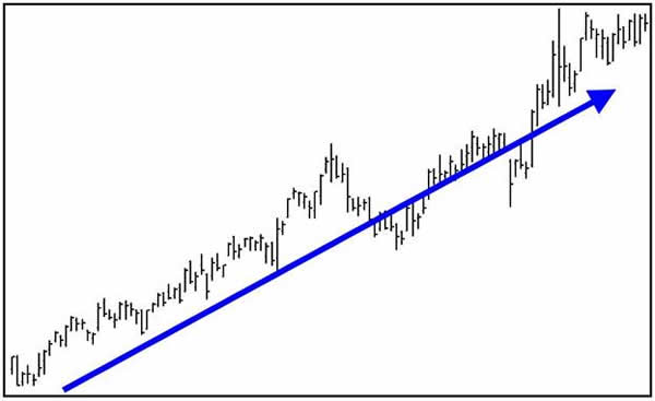
Like much of technical analysis, however,
drawing trend lines is more art than science.
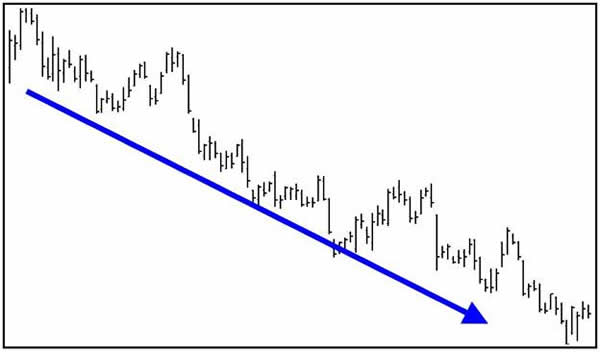
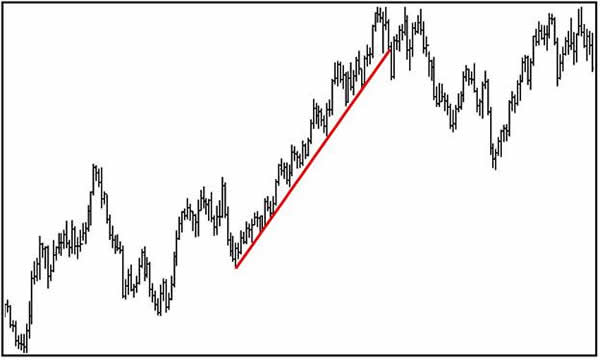
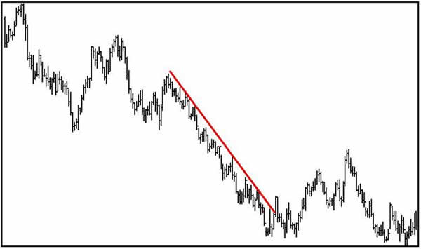
When drawing an uptrend line, you draw a
straight line up to the right along successive
"reaction" lows (see chart below). During a
downtrend, a line is drawn to the right along
successive rally peaks (see chart below). It's
important to note that the more times the trend
line touches rally peaks or reaction lows, the
more powerful and more valid the trend line
becomes.
As mentioned in the basic rules of technical
analysis, a trend in motion tends to stay in
motion. Of course, at some point any trend will
end. One rule for negating trend lines is that
prices must penetrate the trend line resistance
or support level and then show evidence of
follow-through strength or weakness during the
next trading session. However, if prices make a
big push above or below the trend line, then
that trend line is negated without needing
follow-through confirmation.
In some cases, you can draw a line parallel
to the uptrend or downtrend line to form a
trading channel, providing some boundaries
within which the trend unfolds. In an uptrending
move, the straight line across the reaction lows
reveals the trend, and a parallel line across
the highs defines the channel. In a downtrending
market, the straight line across the highs
determines the trend and a channel line is drawn
across the lows.
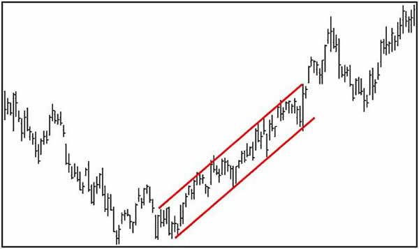
Channels make the trend clearer, and
breakouts in either direction can provide
signals to initiate or exit positions.
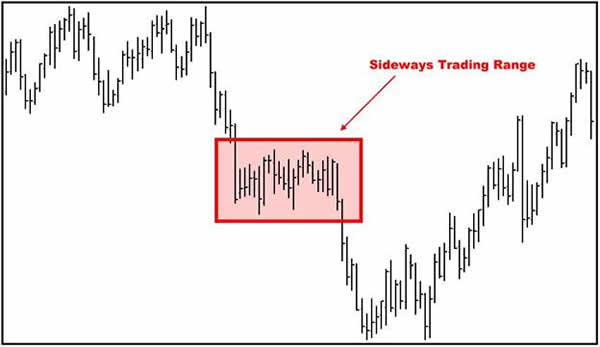
Prices do not always move up or down but
spend much of their time chopping back and
forth. One example of a channel is the formation
that develops during a sideways trading range or
a basing pattern when prices hold in a generally
narrow band at lower price levels for a period
of time. The longer the sideways basing action,
the more powerful the upside breakout from the
trading range is likely to be.
Basic Chart Patterns: Continuation
A market trend tends to persist, as we
mentioned in the previous section. As long as
price action continues to respect a trend by
bouncing off a trend line, the trend line is
perhaps the most powerful continuation pattern.
But other price movements also suggest that the
trend in place is likely to continue.
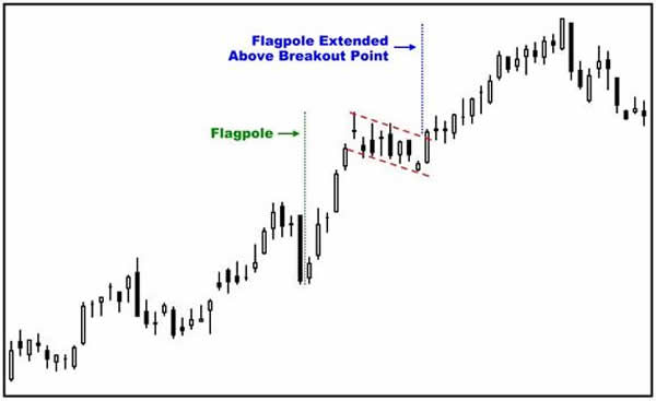
Bullish flags - Bullish flag
patterns occur when a market makes a very strong
uptrend in prices, followed by a pause or
sideways to lower trading for a few price bars,
and then the market resumes a strong price
uptrend. The countertrend move against the main
trend usually lasts just a few days. Sometimes
the initial surge off a bottom looks like a
flagpole and can be used as a measurement
device, adding the length of the flagpole to the
point where prices break out above the flag to
project a price target.
Markets typically fluctuate between periods
of high volatility and periods of low
volatility, and that is how flag patterns are
formed as the market seems to take a breather to
reassess the situation before resuming its
upward climb.
Bearish flags - Bearish flag
patterns are formed when a market makes a strong
price downtrend followed by a pause or sideways
to higher trading for a few price bars, and then
a resumption of the strong price downtrend. As
with a bullish flag, the congestion area that
forms is a period when the market consolidates
and reassesses what it has done before returning
to its downward trek.
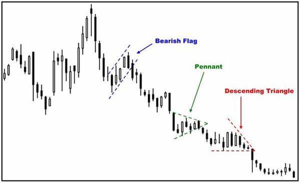
Symmetrical triangles or pennants -
Several types of triangle-shaped
patterns are continuation patterns. Price action
seems to tighten into a coil, with highs and
lows producing smaller ranges as prices move
toward the apex of the triangle. Technical odds
favor a price breakout from the triangle pattern
in the direction of the most recent dominant
price trend – in the chart example above, down.
Descending triangle - Adding
to the succession of patterns suggesting a
continuation of the downtrend on the chart above
is the descending triangle. The market is able
to find buying support at about the same general
level for several days in a row, but the highs
for the day get progressively lower as prices
move toward the apex of the triangle. As with
other triangles, when buyers decide they can no
longer hold the price at the level on the
horizontal side of the triangle and the breakout
eventually occurs, prices are expected to move
in the direction of the dominant trend.
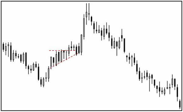
Ascending triangle - The
ascending triangle reverses the appearance of
the descending triangle. Sellers keep the lid on
price movement at the horizontal side of the
triangle but buyers keep pressing the market
higher, causing the lows to be higher each day
until the breakout above the horizontal line
occurs. As the chart indicates, it may take a
few more days of trading as buyers and sellers
retest the breakout. As with other triangles,
the expected move after the breakout is in the
direction of the dominant trend.
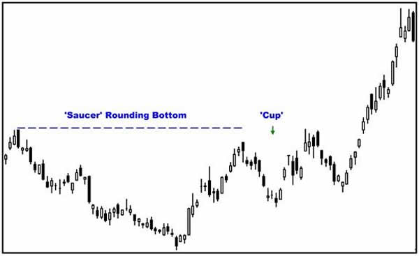
Cup and saucer - Some
analysts call this formation a cup and handle,
but the type of trading activity is the same. A
market makes a gradual descent, trades at a
lower level for a while and then makes a gradual
ascent to form a rounding bottom – the saucer or
the cup, depending on the name you give this
formation. After prices reach the lip on the
right side of the saucer (or cup), the market
runs into resistance from the lip on the left
side and sets back for a short time before
moving back up to the lip level, forming the cup
(or handle). When prices do pick up enough
momentum to break above the lip level, they
often do so with rather vigorous market action
on higher volume, sometimes leaving a gap at the
start of what becomes an extended uptrend.
Basic Chart Patterns: Reversals
Like their name implies, these patterns
suggest that one trend is ending and the market
is ready to begin another trend in the opposite
direction or, perhaps more likely, move sideways
for a while. As with continuation patterns, a
trendline is the basic pattern to watch. If
prices break through a trendline and then follow
through in the same direction, this is the best
evidence of a trend reversal. Keep in mind that
all chart patterns apply to all trading time
frames – daily, weekly, monthly, yearly, hourly
or even minute-by-minute bar charts.
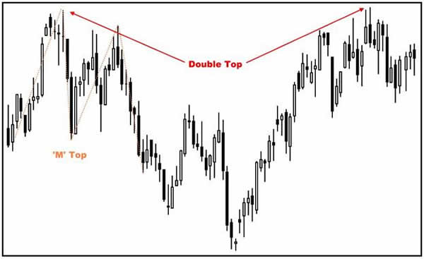
Double tops - This
phenomenon occurs when prices reach a fresh
high, back off from that high, re-test the high
and back off again. The longer the time between
the "twin peaks" of the highs, the more powerful
the chart signal is likely to be. Variations of
this pattern that look somewhat similar are
called "M" tops or 1-2-3 swing tops, but the
second high is usually lower than the first high
for these patterns. In all of these cases, the
key points are the highs, which mark a barrier
that becomes strong resistance, and the interim
low. If prices drop below that low, the top is
confirmed, and it is signal to sell.
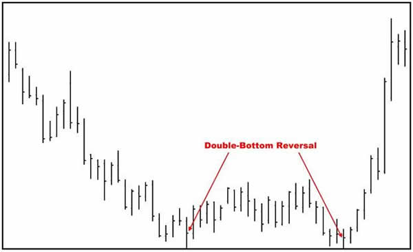
Double bottoms - The
principle of this pattern is the same as the
double-top reversal, except reversed. Similar
patterns are the "W" bottom or 1-2-3 swing
bottom. In all of these patterns, prices reach a
fresh low, rebound a bit, drop back to re-test
the low and then move back higher. When prices
exceed the interim high, a bottom is confirmed,
and the market is providing a signal to buy.
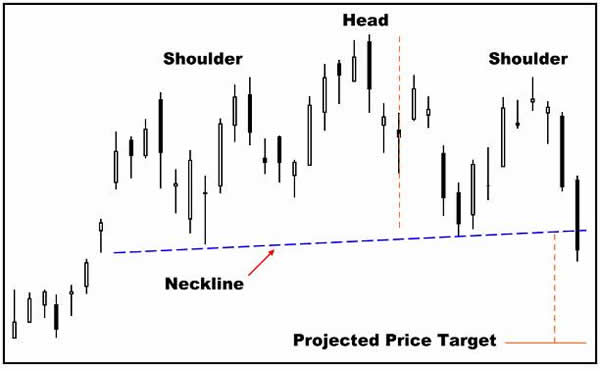
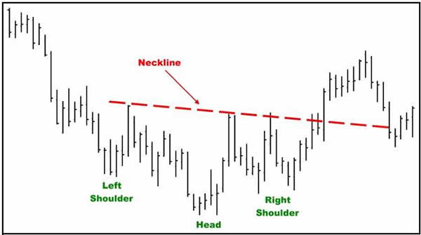
Head-and-shoulders top reversal -
This classic trend reversal pattern
occurs when the market makes a new high (left
shoulder), drops back, runs up to a higher high
(head), drops back again, rallies to a high that
is at about the same level as the left shoulder
high (right shoulder) and then declines again.
The key point is the "neckline" or the
horizontal line that connects the two interim
lows on the chart.
When prices drop below the neckline, that
signals the completion of the top and the
potential beginning of a downtrend although, in
many cases, prices tend to react back to the
trendline so the break does not produce a
downtrend immediately. Sometimes the neckline
break occurs as a gap or with a strong move
down, reinforcing the price reversal.
The head-and-shoulders is one of several
chart patterns that can be used to project a
price target. Analysts measure the distance from
the top of the head to the neckline and then
subtract that distance from the neckline break
to calculate how low prices might go.
Head-and-shoulders bottom reversal -
Just as the double bottom mirrors the
double top, the head-and-shoulders bottom is
like the head-and-shoulders top but in reverse.
That is, prices slide to a low (left shoulder),
rally, then fall back to a lower low (head),
move back up, then sink again to a low at
approximately the same level as the left
shoulder low (right shoulder).
The neckline again is an important point.
When prices break through the neckline, the
reversal pattern is complete and a potential
uptrend may begin. As with the
head-and-shoulders top, there is likely to be
some trading back and forth on either side of
the neckline as the market makes its decision on
which way to go, and the distance between the
neckline and the head can be used to project how
high prices might go.
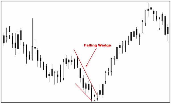
Falling wedge - This pattern
occurs when the market is in an overall price
downtrend and the highs are declining faster
than the lows, forming a wedge shape. Sellers
are able to push prices lower but there is
enough buying support to keep the market from
tumbling. Eventually, the force of selling
begins to dry up and can't take prices lower,
and the market starts to rebound as buying power
exceeds selling power. These patterns are
usually bullish and do portend a change in
trend.
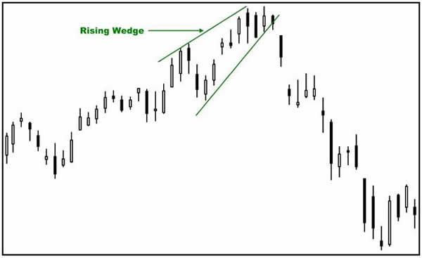
Rising wedge - This pattern
is the reversal of the falling wedge and occurs
when the market is in an overall price uptrend
s. Buyers keep pushing the lows of the day up,
but there is enough selling to keep the market
from taking off higher. Eventually, buying dries
up and the sellers take over, pushing prices
below the short-term wedge uptred line. These
patterns are usually bearish and do portend a
change in trend.
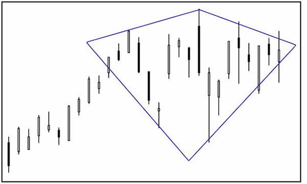
Diamond pattern - This is a
relatively rare pattern that usually occurs at
market tops. Volatility increases at higher
price levels, producing wider range days to form
the widest part of the diamond. Then volatility
decreases on the right side of the high and the
price bars get smaller as they move into a
triangle-like pattern to complete the diamond
formation. This low-volatility, high-volatility,
low-volatility combination usually resolves
itself with a turn to the downside.
More Chart Basics
Several other concepts need to be mentioned
in any discussion of basic chart patterns
because they are an integral part of any
technical analysis toolbox.
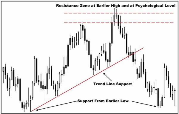
Support and resistance - As
has been mentioned previously in this tutorial,
technical analysis begins with the trend line.
The trend line is also the first point of
support and resistance. Projecting a trend lines
to determine future support and resistance areas
is extremely effective. As the charts in the
trend line discussion illustrated, a trend line
along the lows in an uptrend or across the highs
in a downtrend is a key barrier for prices to
cross if the market is to change trend
direction.
But trend lines aren't the only source of
support and resistance. One of the favorite
methods for determining support and resistance
levels is to look at a bar chart and its past
price history and then see at what price levels
the highs, lows and closes seem to be touching
the most. This method of determining support and
resistance levels works on any bar chart
timeframe – hourly, daily, weekly or monthly.
Many times a bunch of highs or lows will be
concentrated in a small price area but not at
one specific price. Instead, you have a support
or resistance "zone" that should be rather
narrow to be effective.
Major price tops and bottoms are also major
resistance and support levels. Unfilled price
gaps on charts also qualify as very good support
and resistance levels. Moving averages,
especially longer-term ones, can also provide
support or resistance. Still another way that
support and resistance levels can be identified
is through geometric angles from a certain key
price point, a concept most often associated
with W.D. Gann, a legendary stock and commodity
trader who died in 1955.
Finally, support and resistance levels can be
determined by "psychological" price levels.
These are usually round numbers that are very
significant in a market. For example, in crude
oil, a psychological price level might be $60
per barrel. For soybeans, that might be $5 or $6
per bushel or in cotton, 50 cents a pound. These
levels mark clear step-up or step-down prices
where the market often pauses to reassess the
situation.
Many chart patterns develop as a result of
price action at support and resistance areas.
For example, a double bottom may form because
prices find support from an earlier bottom, or a
triangle may form as prices are unable to
overcome short-term trend line support or
resistance until a breakout eventually does
occur.
One important point to note about support and
resistance is that when a key support level or
zone is penetrated on the downside, that level
or zone will likely become key resistance.
Likewise, a key resistance level or zone that is
penetrated on the upside will then likely become
a key support level or zone.
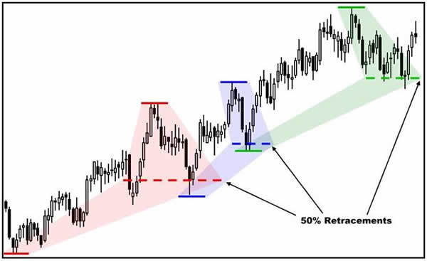
Retracements - Another way
to discover support or resistance areas is by
looking at "retracements" of a significant price
move – price moves that are counter to an
existing price trend. These moves are also
called "corrections." Once a market has broken
through a trend line, the first thing many
traders want to know is how far this new move or
correction will extend.
Based on studies of past price history, a
popular retracement is 50% of the previous
trend. For example, let's say a market is in a
solid uptrend that began at 100 and rallies to
200. Then comes the correction, a common
occurrence as markets seldom make one-way moves.
How far will prices back off? Analysts who rely
on retracements would put a target at 150 or 50%
of the move from 100 to 200 and expect prices to
bounce back up and resume the uptrend after
reaching or nearing that price level. A
correction retracement less than 50% indicates a
stronger market, a retracement of more than 50%
a weaker market.
The 50% mark isn't the only popular
retracement level. Some analysts use the 33% and
67% levels as support or resistance. Followers
of Fibonacci numbers use 0.382% and 0.618% of a
prior move as key support and resistance levels.
No matter what you use as an expected
retracement target, it gains heightened validity
if it coincides with some other important form
of support or resistance such as a trend line,
previous high or low or a gap.
Gaps - Gaps are areas on a
price chart where no trading occurs. The last
bar's low is higher than the previous bar's high
for a gap-higher move. The last bar's high is
lower than the previous bar's low to form a
gap-lower move. For example, if a market closes
at 100 in one session and then opens at 105 in
the next section, a 5-point gap would be evident
on a chart.
With electronic trading 24 hours a day, gaps
are less likely to appear as the market moves
fluidly from one price to the next. However, for
those markets that have only day sessions, which
includes most physical commodities as well as
stocks, gaps may show up because of some
overnight news or development that causes a
sudden shift in prices. Price gaps typicallly
indicate a strong market move, and many times
the gaps will then serve as important support or
resistance levels on the chart.
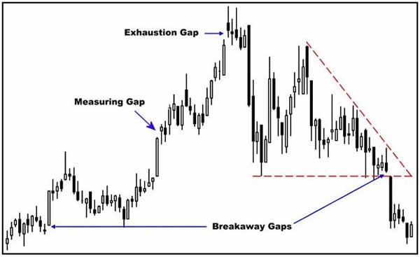
Gaps cannot be characterized as reversal or
continuation signals as different gaps mean
different things – and sometimes have little
impact at all. There are three main types of
gaps:
- Breakaway gap. These occur at the
beginning of a move as prices reject the
previous tend and suddenly reverse course or
at the breakout point of a chart formation
such as a trend line or a triangle. The
breakaway may be due to new conditions that
have become known to traders or because
pent-up buying or selling erupts in a strong
move.
- Measuring gap. As the market moves up or
down, it may suddenly leave a gap higher or
lower on some new development. Some analysts
view such gaps as the halfway point to an
ultimate price objective. It obviously is
impossible to know that for sure until a
move is complete so these gaps are a little
tricky to use in analysis. However, you may
be able to combine a gap projection with a
well-defined support or resistance area such
as a previous high or low to arrive at a
potential price target.
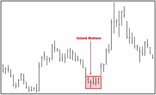
- Exhaustion gap. This gap appears at the
end of an extended move and reflects a last
burst of buying in an uptrend or selling in
a downtrend. Once this exuberant buying or
selling has occurred, there are no new
buyers or sellers to maintain the trend –
the force that was driving the trend has
been exhausted. As a result, the turn in the
trend can produce some dramatic moves in the
opposite direction as the late buyers or
sellers scramble to unload their losing
positions. This is the type of situation
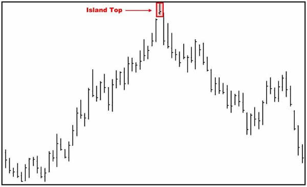
that sometimes produces island tops or
island bottoms on a price chart. One day or
several days of price action may be isolated
by an exhaustion gap and then a breakaway
gap during the market's sudden turnabout.
|