| MACD - Moving Average Convergence Divergence |
| Introduction |
Developed by Gerald Appel, Moving Average Convergence Divergence (MACD) is one of the simplest and most reliable indicators available. MACD uses moving averages, which are lagging indicators, to include some trend-following characteristics. These lagging indicators are turned into a momentum oscillator by subtracting the longer moving average from the shorter moving average. The resulting plot forms a line that oscillates above and below zero, without any upper or lower limits. MACD is a centered oscillator and the guidelines for using centered oscillators apply.
| MACD Formula |
The most popular formula for the "standard" MACD is the difference between a security's 26-day and 12-day exponential moving averages. This is the formula that is used in many popular technical analysis programs, including SharpCharts, and quoted in most technical analysis books on the subject. Appel and others have since tinkered with these original settings to come up with a MACD that is better suited for faster or slower securities. Using shorter moving averages will produce a quicker, more responsive indicator, while using longer moving averages will produce a slower indicator, less prone to whipsaws. For our purposes in this article, the traditional 12/26 MACD will be used for explanations. Later in the indicator series, we will address the use of different moving averages in calculating MACD.
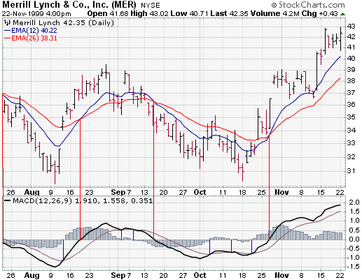
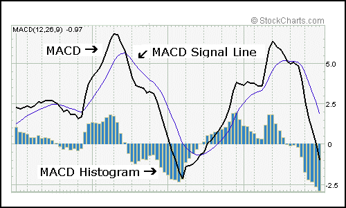
Of the two moving averages that make up MACD, the 12-day EMA is the faster and the 26-day EMA is the slower. Closing prices are used to form the moving averages. Usually, a 9-day EMA of MACD is plotted along side to act as a trigger line. A bullish crossover occurs when MACD moves above its 9-day EMA and a bearish crossover occurs when MACD moves below its 9-day EMA. The Merrill Lynch chart below shows the 12-day EMA (thin blue line) with the 26-day EMA (thin red line) overlaid the price plot. MACD appears in the box below as the thick black line and its 9-day EMA is the thin blue line. The histogram represents the difference between MACD and its 9-day EMA. The histogram is positive when MACD is above its 9-day EMA and negative when MACD is below its 9-day EMA.
Merrill Lynch
| What does MACD do? |
MACD measures the difference between two moving averages. A positive MACD indicates that the 12-day EMA is trading above the 26-day EMA. A negative MACD indicates that the 12-day EMA is trading below the 26-day EMA. If MACD is positive and rising, then the gap between the 12-day EMA and the 26-day EMA is widening. This indicates that the rate-of-change of the faster moving average is higher than the rate-of-change for the slower moving average. Positive momentum is increasing and this would be considered bullish. If MACD is negative and declining further, then the negative gap between the faster moving average (green) and the slower moving average (blue) is expanding. Downward momentum is accelerating and this would be considered bearish. MACD centerline crossovers occur when the faster moving average crosses the slower moving average.
Merrill Lynch
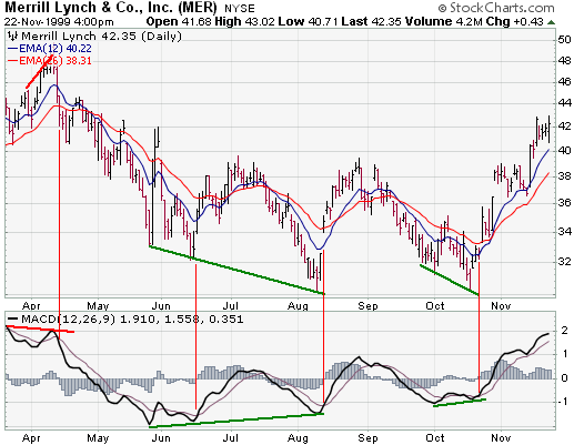
This Merrill Lynch chart shows MACD as a solid black line and its 9-day EMA as the thin blue line. Even though moving averages are lagging indicators, notice that MACD moves faster than the moving averages. In this example with Merrill Lynch, MACD also provided a few good trading signals as well.
| MACD Bullish Signals |
MACD generates bullish signals from three main sources:
Positive Divergence
Novellus
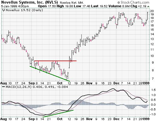
A positive divergence occurs when MACD begins to advance and the security is
still in a downtrend and makes a lower reaction low. MACD can either form as a
series of higher lows or a second low that is higher than the previous low.
Positive divergences are probably the least common of the three signals, but are
usually the most reliable and lead to the biggest moves.
Bullish Moving Average Crossover
Novellus
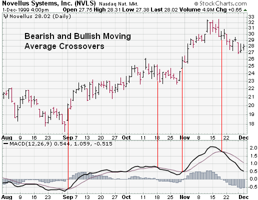
A bullish moving average crossover occurs when MACD moves above its 9-day EMA or
trigger line. Bullish moving average crossovers are probably the most common
signals and as such are the least reliable. If not used in conjunction with
other technical analysis tools, these crossovers can lead to whipsaws and many
false signals. Moving average crossovers are sometimes used to confirm a
positive divergence. The second low or higher low of a positive divergence can
be considered valid when it is followed by a bullish moving average crossover.
Sometimes it is prudent to apply a price filter to the moving average crossover in order to ensure that it will hold. An example of a price filter would be to buy if MACD breaks above the 9-day EMA and remains above for three days. The buy signal would then commence at the end of the third day.
Bullish Centerline Crossover
Apple
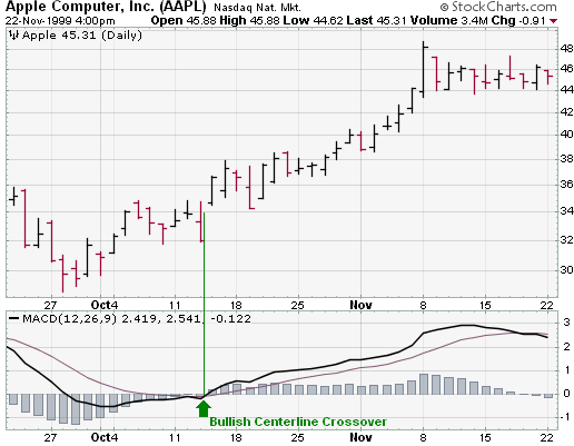
A bullish centerline crossover occurs when MACD moves above the zero line and
into positive territory. This is a clear indication that momentum has changed
from negative to positive, or from bearish to bullish. After a positive
divergence and bullish moving average crossover, the centerline crossover can
act as a confirmation signal. Of the three signals, moving average crossover are
probably the second most common signals.
Using a Combination of Signals
Halliburton
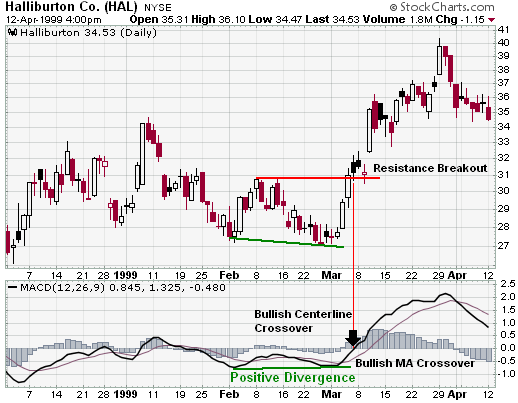
Even though some traders may use only one of the above signals to form a buy or
a sell signal, using a combination can generate more robust signals. In the
Halliburton example, all three bullish signals were present and the stock still
advanced another 20%. The stock formed a lower low at the end of February, but
MACD formed a higher low, thus creating a potential positive divergence. MACD
then formed a bullish crossover by moving above its 9-day EMA. And finally, MACD
traded above zero to form a bullish centerline crossover. At the time of the
bullish centerline crossover, the stock was trading at 32 1/4 and went above 40
immediately after that. In August, the stock traded above 50.
| Bearish Signals |
MACD generates bearish signals from three main sources. These signals are mirror reflections of the bullish signals.
Negative Divergence
A negative divergence forms when the security advances or moves sideways and
MACD declines. The negative divergence in MACD can take the form of either a
lower high or a straight decline. Negative divergences are probably the least
common of the three signals, but are usually the most reliable and can warn of
an impending peak.
Federal Express
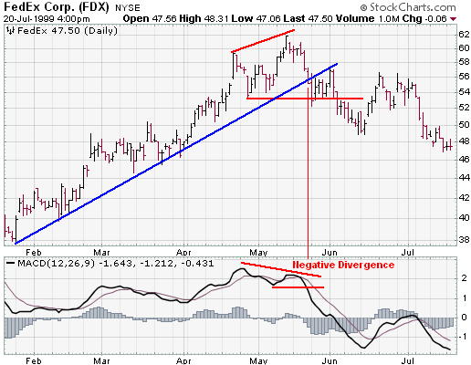
The FDX chart shows a negative divergence when MACD formed a lower high in May and the stock formed a higher high at the same time. This was a rather blatant negative divergence and signaled that momentum was slowing. A few days later, the stock broke the uptrend line and MACD formed a lower low.
There are two possible means of confirming a negative divergence. First, the indicator can form a lower low. This is traditional peak-and-trough analysis applied to an indicator. With the lower high and subsequent lower low, the up trend for MACD has changed from bullish to bearish. Second, a bearish moving average crossover, which is explained below, can act to confirm a negative divergence. As long as MACD is trading above its 9-day EMA or trigger line, it has not turned down and the lower high is difficult to confirm. When MACD breaks below its 9-day EMA, it signals that the short-term trend for the indicator is weakening, and a possible interim peak has formed.
Bearish moving average crossover
The most common signal for MACD is the moving average crossover. A bearish
moving average crossover occurs when MACD declines below its 9-day EMA. Not only
are these signals the most common, but they also produce the most false signals.
As such, moving average crossovers should be confirmed with other signals to
avoid whipsaws and false readings.
Merck
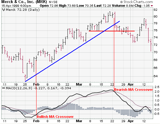
Sometimes a stock can be in a strong uptrend and MACD will remain above its trigger line for a sustained period of time. In this case, it is unlikely that a negative divergence will develop. A different signal is needed to identify a potential change in momentum. This was the case with MRK in February and March. The stock advanced in a strong up trend and MACD remained above its 9-day EMA for 7 weeks. When a bearish moving average crossover occurred, it signaled that upside momentum was slowing. This slowing momentum should have served as an alert to monitor the technical situation for further clues of weakness. Weakness was soon confirmed when the stock broke its uptrend line and MACD continued its decline and moved below zero.
Bearish centerline crossover
A bearish centerline crossover occurs when MACD moves below zero and into
negative territory. This is a clear indication that momentum has changed from
positive to negative, or from bullish to bearish. The centerline crossover can
act as an independent signal, or confirm a prior signal such as a moving average
crossover or negative divergence. Once MACD crosses into negative territory,
momentum, at least for the short term, has turned bearish.
Unisys
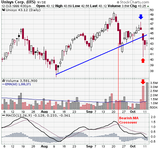
The significance of the centerline crossover will depend on the previous movements of MACD as well. If MACD is positive for many weeks, begins to trend down and then crosses into negative territory, it would be considered bearish. However, if MACD has been negative for a few months, breaks above zero and then back below, it may be seen as more of a correction. In order to judge the significance of a centerline crossover, traditional technical analysis can be applied to see if there has been a change in trend, higher high or lower low.
The UIS chart depicts a bearish centerline crossover that preceded a 25% drop in the stock that occurs just off the right edge of the chart. Although there was little time to act once this signal appeared, there were other warnings signs just prior to the dramatic drop.
In addition to the signal mentioned above, the bearish centerline crossover occurred after MACD had been above zero for almost two months. Since 20-Sept, MACD had been weakening and momentum was slowing. The break below zero acted as the final straw of a long weakening process.
| Combining Signals |
As with bullish MACD signals, bearish signals can be combined to create more robust signals. In most cases, stocks fall faster than they rise. This was definitely the case with UIS and only two bearish MACD signals were present. Using momentum indicators like MACD, technical analysis can sometimes provide clues to impending weakness. While it may be impossible to predict the length and duration of the decline, being able to spot weakness can enable traders to take a more defensive position.
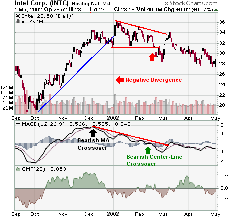
In 2002, Intel dropped from above 36 to below 18 in a few months. Yet it would seem that smart money began distributing the stock before the actual decline. Looking at the technical picture, we can spot evidence of this distribution and a serious loss of momentum.
For those waiting for a recovery in the stock, the continued decline of momentum suggested that selling pressure was increasing, and not about to decrease. Hindsight is 20/20, but with careful study of past situations, we can learn how to better read the present and prepare for the future.
| MACD Benefits |
One of the primary benefits of MACD is that it incorporates aspects of both momentum and trend in one indicator. As a trend-following indicator, it will not be wrong for very long. The use of moving averages ensures that the indicator will eventually follow the movements of the underlying security. By using exponential moving averages, as opposed to simple moving averages, some of the lag has been taken out.
As a momentum indicator, MACD has the ability to foreshadow moves in the underlying security. MACD divergences can be key factors in predicting a trend change. A negative divergence signals that bullish momentum is waning and there could be a potential change in trend from bullish to bearish. This can serve as an alert for traders to take some profits in long positions, or for aggressive traders to consider initiating a short position.
MACD can be applied to daily, weekly or monthly charts. MACD represents the convergence and divergence of two moving averages. The standard setting for MACD is the difference between the 12 and 26-period EMA. However, any combination of moving averages can be used. The set of moving averages used in MACD can be tailored for each individual security. For weekly charts, a faster set of moving averages may be appropriate. For volatile stocks, slower moving averages may be needed to help smooth the data. No matter what the characteristics of the underlying security, each individual can set MACD to suit his or her own trading style, objectives and risk tolerance.
| MACD Drawbacks |
One of the beneficial aspects of MACD may also be a drawback. Moving averages, be they simple, exponential or weighted, are lagging indicators. Even though MACD represents the difference between two moving averages, there can still be some lag in the indicator itself. This is more likely to be the case with weekly charts than daily charts. One solution to this problem is the use of the MACD-Histogram.
MACD is not particularly good for identifying overbought and oversold levels. Even though it is possible to identify levels that historically represent overbought and oversold levels, MACD does not have any upper or lower limits to bind its movement. MACD can continue to overextend beyond historical extremes.
MACD calculates the absolute difference between two moving averages and not the percentage difference. MACD is calculated by subtracting one moving average from the other. As a security increases in price, the difference (both positive and negative) between the two moving averages is destined to grow. This makes its difficult to compare MACD levels over a long period of time, especially for stocks that have grown exponentially.
Amazon
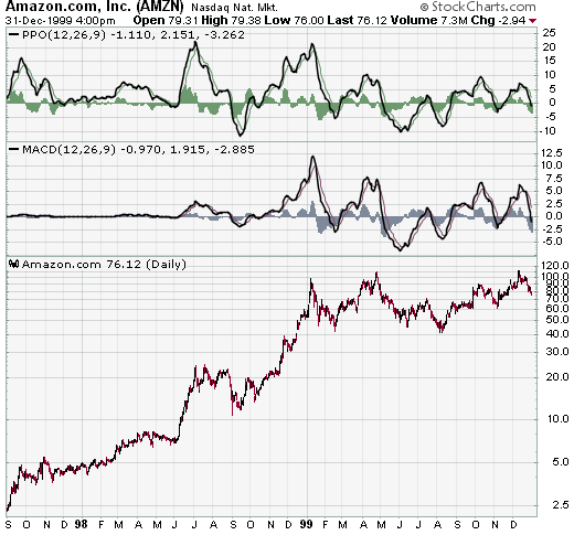
The AMZN chart demonstrates the difficult in comparing MACD levels over a long period of time. Before 1999, AMZN's MACD is barely recognizable and appears to trade close to the zero line. MACD was indeed quite volatile at the time, but this volatility has been dwarfed since the stock rose from below 20 to almost 100.
An alternative is to use the Price Oscillator, which find the percentage difference between two moving averages:
(12 day EMA - 26 day EMA) / (12 day EMA)
(20 - 18) / 20 = .10 or +10%
The resulting percentage difference can be compared over a longer period of time. On the AMZN chart, we can see that the Price Oscillator provides a better means for a long-term comparison. For the short term, MACD and the Price Oscillator are basically the same. The shape of the lines, the divergences, moving average crossovers and centerline crossovers for MACD and the Price Oscillator are virtually identical.
| MACD Conclusion |
Since Gerald Appel developed MACD, there have been hundreds of new indicators introduced to technical analysis. While many indicators have come and gone, MACD is an oscillator that has stood the test of time. The concept behind its use is straightforward and its construction simple, yet it remains one of the most reliable indicators around. The effectiveness of MACD will vary for different securities and markets. The lengths of the moving averages can be adapted for a better fit to a particular security or market. As with all indicators , MACD is not infallible and should be used in conjunction with other technical analysis tools.
| MACD-Histogram |
In 1986, Thomas Aspray developed the MACD-Histogram. Some of his findings were presented in a series of articles for Technical Analysis of Stocks and Commodities. Aspray noted that MACD would sometimes lag important moves in a security, especially when applied to weekly charts. He first experimented by changing the moving averages and found that shorter moving averages did indeed speed up the signals. However, he was looking for a means to anticipate MACD crossovers. One of the answers he came up with was the MACD-Histogram.
MACD
| Definition and Construction |
The MACD-Histogram represents the difference between MACD and the 9-day EMA of MACD, which can also be referred to as the signal or trigger line. The plot of this difference is presented as a histogram, making centerline crossovers and divergences are easily identifiable. A centerline crossover for the MACD-Histogram is the same as a moving average crossover for MACD. If you will recall, a moving average crossover occurs when MACD moves above or below the signal line.
If the value of MACD is larger than the value of its 9-day EMA, then the value on the MACD-Histogram will be positive. Conversely, if the value of MACD is less than its 9-day EMA, then the value on the MACD-Histogram will be negative.
Further increases or decreases in the gap between MACD and its 9-day EMA will be reflected in the MACD-Histogram. Sharp increases in the MACD-Histogram indicate that MACD is rising faster than its 9-day EMA and bullish momentum is strengthening. Sharp declines in the MACD-Histogram indicate that MACD is falling faster than its 9-day EMA and bearish momentum is increasing.
MACD
On the chart above, we can see that MACD-Histogram movements are relatively independent of the actual MACD. Sometimes MACD is rising while the MACD-Histogram is falling. At other times, MACD is falling while MACD-Histogram is rising. MACD-Histogram does not reflect the absolute value of MACD, but rather the value of MACD relative to its 9-day EMA. Usually, but not always, a move in MACD is preceded by a corresponding divergence in MACD-Histogram.
| Usage |
Thomas Aspray designed the MACD-Histogram as a tool to anticipate a moving average crossover in MACD. Divergences between MACD and the MACD-Histogram are the main tool used to anticipate moving average crossovers. A positive divergence in the MACD-Histogram indicates that MACD is strengthening and could be on the verge of a bullish moving average crossover. A negative divergence in the MACD-Histogram indicates that MACD is weakening and can act to foreshadow a bearish moving average crossover in MACD.
In his book, Technical Analysis of the Financial Markets, John Murphy asserts that the MACD-Histogram is best used to identify periods when the gap between MACD and its 9-day EMA is either widening or shrinking. Broadly speaking, a widening gap indicates strengthening momentum and a shrinking gap indicates weakening momentum. Usually a change in the MACD-Histogram will precede any changes in MACD.
| Signals |
The main signal generated by the MACD-Histogram is a divergence followed by a moving average crossover. A bullish signal is generated when a positive divergence forms and there is a bullish centerline crossover. A bearish signal is generated when there is a negative divergence and a bearish centerline crossover. Keep in mind that a centerline crossover for the MACD-Histogram represents a moving average crossover for MACD.
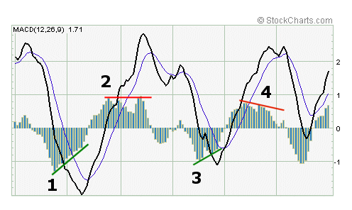
Divergences can take many forms and varying degrees. Generally speaking, two types of divergences have been identified: the slant divergence and the peak-trough divergence.
Unisys
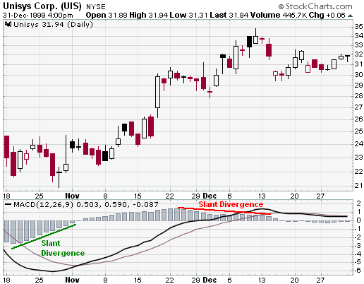
A slant divergence forms when there is a continuous and relatively smooth move in one direction (up or down) to form the divergence. Slant divergences generally cover a shorter timeframe than divergences formed with two peaks or two troughs. A slant divergence can contain some small bumps (peaks or troughs) along the way. The world of technical analysis is not perfect and there are exceptions to most rules and hybrids for many signals.
General Electric
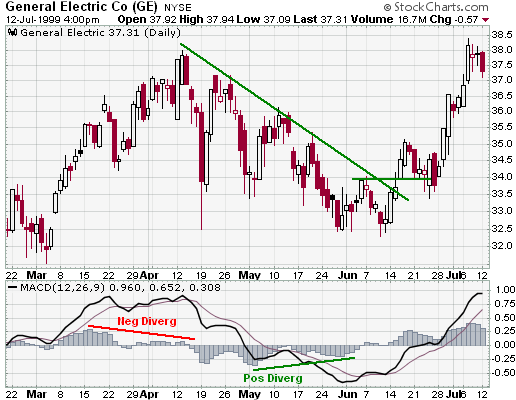
A peak-trough divergence occurs when at least two peaks or two troughs develop in one direction to form the divergence. A series of two or more rising troughs (higher lows) can form a positive divergence and a series of two or more declining peaks (lower highs) can form a negative divergence. Peak-trough divergences usually cover a longer timeframe than slant divergences. On a daily chart, a peak-trough divergence can cover a timeframe as short as two weeks or as long as several months.
Usually, the longer and sharper the divergence is, the better any ensuing signal will be. Short and shallow divergences can lead to false signals and whipsaws. In addition, it would appear that peak-trough divergences are a bit more reliable than slant divergences. Peak-trough divergences tend to be sharper and cover a longer time frame than slant divergences.
| MACD-Histogram Benefits |
The main benefit of the MACD-Histogram is its ability to anticipate MACD signals. Divergences usually appear in the MACD-Histogram before MACD moving average crossovers. Armed with this knowledge, traders and investors can better prepare for potential trend changes.
MACD-Histogram can be applied to daily, weekly or monthly charts. (Note: This may require some tinkering with the number of periods used to form the original MACD; shorter or faster moving averages may be required for weekly and monthly charts.) Using weekly charts, the broad underlying trend of a stock can be determined. Once the broad trend has been determined, daily charts can be used to time entry and exit strategies.
In Technical Analysis of the Financial Markets, John Murphy advocates this type of two-tiered approach to investing in order to avoid making trades against the major trend. The weekly MACD-Histogram can be used to generate a long-term signal in order to establish the tradable trend. Then only short-term signals that agree with the major trend would be considered. If the long-term trend were bullish, only negative divergences with bearish centerline crossovers would be considered valid for the MACD-Histogram. If the long-term trend were bearish, only positive divergences with bullish centerline crossovers would be considered valid.
IBM
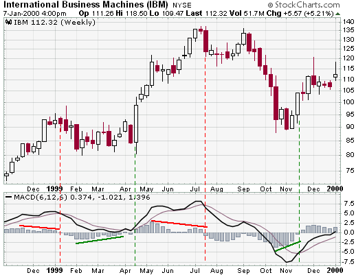
On the IBM weekly chart, the MACD-Histogram generated four signals. Before each moving average crossover in MACD, a corresponding divergence formed in the MACD-Histogram. To make adjustments for the weekly chart, the moving averages have been shortened to 6 and 12. This MACD is formed by subtracting the 6-week EMA from the 12-week EMA. A 6-week EMA has been used as the trigger. The MACD-Histogram is calculated by taking the difference between MACD (6/12) and the 6-day EMA of MACD (6/12).
The third signal was based on a peak-trough divergence. Two readily identifiable and consecutive lower peaks formed to create the divergence. The peaks and troughs on the previous divergences, although identifiable, do not stand out as much.
| MACD-Histogram Drawbacks |
The MACD-Histogram is an indicator of an indicator or a derivative of a derivative. MACD is the first derivative of the price action of a security and the MACD-Histogram is the second derivative of the price action of a security. As the second derivative, the MACD-Histogram is further removed from the actual price action of the underlying security. The further removed an indicator is from the underlying price action, the greater the chances of false signals. Keep in mind that this is an indicator of an indicator. MACD-Histogram should not be compared directly with the price action of the underlying security.
Because MACD-Histogram was designed to anticipate MACD signals, there may be a temptation to jump the gun. The MACD-Histogram should be used in conjunction with other aspects of technical analysis. This will help to alleviate the temptation for early entry. Another means to guard against early entry is to combine weekly signals with daily signals. There will of course be more daily signals than weekly signals. However, by using only the daily signals that agree with the weekly signals, there will be fewer daily signals to act on. By acting only on those daily signals that are in agreement with the weekly signals, you are also assured of trading with the longer trend and not against it.
Be careful of small and shallow divergences. While these may sometimes lead to good signals, they are also more apt to create false signals. One method to avoid small divergences is to look for larger divergences with two or more readily identifiable peaks or troughs. Compare the peaks and troughs from past action to determine significance. Only peaks and troughs that appear to be significant should warrant attention.
| MACD and SharpCharts2 |
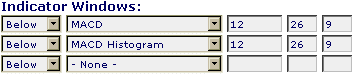
Using SharpCharts2, MACD can be set as an indicator above or below a security's price plot. Once the indicator is chosen from the drop down list, the three boxes to the right are used to adjust the settings. The default setting is (12,26,9), which automatically appears. The default would use a 12-day EMA and 26-day EMA to calculate MACD and a 9-day EMA of MACD as the signal/trigger line. MACD appears as the thick solid line and the signal/trigger line as the thinner and smoother line. Typically, MACD crosses above and below its signal line as it fluctuates around the zero line.
The histogram is the MACD-Histogram, which measures the difference between MACD and its signal/trigger line. Simply charting the MACD indicator will also create a MACD histogram as an overlay, or you can chart the histogram separately by selecting it from the drop-down menu. The scale shows the range of values for MACD. Stocks with low prices (eg between 10 and 20) will have a smaller MACD range and stocks with high prices (eg above 100) will have a higher MACD range.