Bollinger Bands
Trading bands, which are lines plotted in and around the
price structure to form an envelope, are the action of prices near the edges of
the envelope that we are interested in. They are one of the most powerful
concepts available to the technically based investor, but they do not, as is
commonly believed, give absolute buy and sell signals based on price touching
the bands. What they do is answer the perennial question of whether prices are
high or low on a relative basis. Armed with this information, an intelligent
investor can make buy and sell decisions by using indicators to confirm price
action.
But before we begin, we need a definition of what we are
dealing with. Trading bands are lines plotted in and around the price structure
to form an "envelope." It is the action of prices near the edges of the envelope
that we are particularly interested in. The earliest reference to trading bands
I have come across in technical literature is in The Profit Magic of Stock
Transaction Timing; author J.M. Hurst's approach involved the drawing of
smoothed envelopes around price to aid in cycle identification.
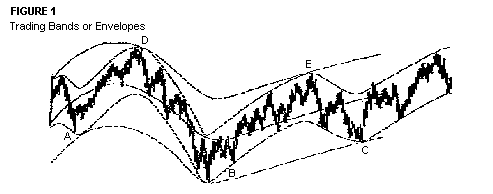
Figure 1 shows an example of this technique:
Note in particular the use of different envelopes for cycles of differing
lengths.
The next major development in the idea of trading bands
came in the mid to late 1970s, as the concept of shifting a moving average up
and down by a certain number of points or a fixed percentage to obtain an
envelope around price gained popularity, an approach that is still employed by
many. A good example appears in Figure 2, where an envelope has been constructed
around the Dow Jones Industrial Average (DJIA). The average used is a 21-day
simple moving average. The bands are shifted up and down by 4%.
FIGURE 2:
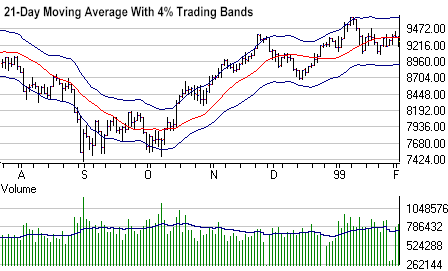
The procedure to create such a chart is straightforward.
First, calculate and plot the desired average. Then calculate the upper band by
multiplying the average by 1 plus the chosen percent (1 + 0.04 = 1.04). Next,
calculate the lower band by multiplying the average by the difference between 1
and the chosen percent (1 - 0.04 = 0.96). Finally, plot the two bands. For the
DJIA, the two most popular averages are the 20- and 21-day averages and the most
popular percentages are in the 3.5 to 4.0 range.